

When the App Store first arrived, designing an iOS app was a straightforward process; you only had to worry about how the app would look and operate on a single device. But as the iPhone evolved, variations in screen sizes were introduced and it became a challenge to maintain consistency across devices whilst making efficient use of screen space.
Typically, when we think of user experience, the first thing that comes to mind is, “How do people interact with my product?”, but today when people use their devices standing up on public transport, walking, or running, it’s equally as important to consider how well your product reacts in those situations.
At Slack, we’re no strangers to these kinds of challenges, and we have embedded this way of thinking into how we design and develop new features. In this article, we’ll explore how Slack maintains the fine balance between usability and user experience on larger screen mobile devices, and how the need for PanModal arose. As such, we hope PanModal will benefit other iOS developers facing similar challenges.
Designing for Thumbs
So what does it mean to design for thumbs?
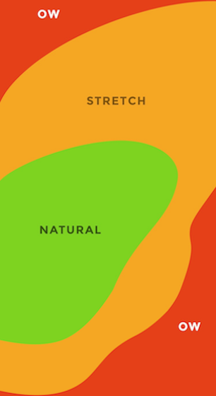
Designing for thumbs refers to the process of designing a user interface that’s most comfortable for the thumb’s natural grasp. For brevity, we’ll analyze the issue of thumb reachability for right handed users, but this can also be applied for the left or both thumbs.
As you can see in the image, from a right handed perspective, there are three zones of reachability. Those three zones are:
- Green: represents natural movement
- Yellow: represents movements which are a bit more of a stretch but are still comfortable
- Red: represents areas that are harder to reach
The ideal approach taken when designing for thumbs is to limit the primary or secondary actions to sit somewhere between the green and yellow zone. Reserving the red zone for much less frequent actions.
Applying Our Findings to Slack
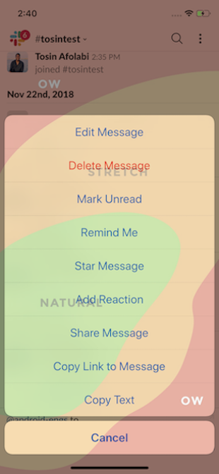
Most Slack iPhone sessions can be described as a user reading a message and then initiating an action. A sizable portion of these are actions on the messages themselves, including marking unread and adding reactions (both initiate from a long press). So naturally, we began to explore the various ways we could give users more freedom in what they can do with messages.
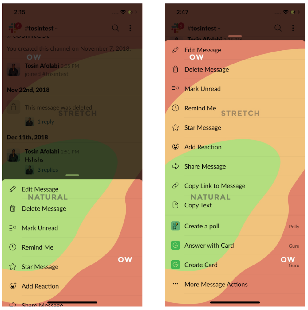
As part of this exploration, we analyzed how our current UI stacked up to the thumb reachability matrix before adding more content to the native iOS Action Sheet.
The results were far from ideal. Some frequently used actions were already outside the natural bounds of human thumb extension. Adding more actions to the already long list would mean pushing the most used actions further up into the red zone. This forces users to adjust the position of their operating hand (relative to their phones) every time they need to act on a message. In our pursuit of a more pleasant user experience, we concluded that we had to create a custom solution to solve the foundational problem.
Design and Engineering Collaboration
In order to improve the overall experience, we needed to bring message actions closer to user thumbs. We worked closely with our talented product designers to explore the different approaches we could take. We even considered truncating and prioritizing the original list, leaving behind only the most crucial actions, relegating the rest accessible only via a “More” button or some other form of menu; whilst this would fix our problem in the short term, there was no guarantee this wouldn’t become a problem in the future.
So we came up with an alternative solution to the problem: create an expandable list in the form of a draggable modal. This would allow us to place the most frequently used actions right into the green zone, and should none of those actions be what you need, a simple upward swipe gesture will allow you to have access to the secondary actions without having to leave the optimal thumb reachability zone.
But what would it take to build something like this for iOS?
UIViewControllerTransitioning
UIViewControllerTransitioning is a UIKit API included in the iOS SDK, enabling customization during the transition process in which one UIViewController is presented on top of another. It consists of three parts: the delegate, the controller and the animator, each playing a different role in the presentation.
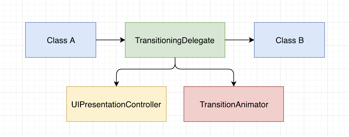
The transitioningDelegate is essentially the starting point for the presentation process. It vends UIViewControllerAnimatedTransitioning and UIPresentationController objects on request, both required for a transition to occur.
The UIViewControllerAnimatedTransitioning protocol allows you to define an animation object used to present or dismiss a UIViewController within a set amount of time. Animations can be customized to translate a view within the coordinate system of the presentation bounds.
The UIPresentationController maintains the view hierarchy between both view controllers, responding to changes in environment appropriately, including device rotations and split view activation.
As both the animation and controller objects are weakly referenced during the transition process, they are both quickly released after the initial presentation — unless a reference is maintained elsewhere.
Custom Modal Transitioning
In order to initiate a custom transition, an object conforming to UIViewControllerTransitioningDelegate must be set as the transitioningDelegate on the viewControllerToPresent and its modalPresentationStyle set to .custom.
Understanding that a custom presentation is simply the sum of its components working in sync, we began to experiment with reusable UI modal transitions that could be utilized across the Slack app.
Before we began building though, we compiled a list of crucial goals that we wanted to achieve for the new project.
- Build a simple, elegant, and robust API
- Support any subclass of UIViewController
- Maintain 60 FPS performance
- Abstract transitions between modal and content
- Each component of PanModal should be able to operate independently of the framework
Since this would mean having similar functionality to the modalViewController (deprecated in iOS 6), with the addition of UIPanGestureRecognizer management, it felt appropriate to give the library a name that would consolidate both of these classes: PanModal.
What We’ve Learned
Taking a bottom-up approach to the problem and having a focus on reusability turned out to be really useful when we were building out each component, from the animator to the controller.
It allowed us to be really strict on the responsibilities of each object, outside of the default transitioning system. For example: To be able to plug the PanModalPresentationController into any custom transitioningDelegate meant that we had to limit direct access to its internals, instead opting to only use the PanModalPresentable for configuration, which is the only protocol visible outside the scope of the framework.
This, in turn, allowed us to completely encapsulate the management of the internal UIPanGestureRecognizer and abstract the entire system down to one call.
However, the goal of supporting any subclass of UIViewController was not as straight forward. Once the view controller had a child UIScrollView, whether it’s the first view in the hierarchy (as is the case with UITableViewController) or the last, it interfered with the internal UIPanGestureRecognizer.
Pan gestures had to be tracked by both the child UIScrollView and the PanModal system, only responding when necessary (e.g. the user should only be able to scroll on the content when the PanModal is in long form). Simply disabling and re-enabling UIPanGestureRecognizers at appropriate points was not an option here as there is no way to continue tracking touches within the same touch event without retouching the screen (not an ideal experience for the user). We spent a lot of time building a system that would suspend one recognizer while the other responded to pan gestures — without both responding to touch events at the same time.
Once the system worked as expected, we had to find a way for the presentedViewController to provide a reference to a chosen child UIScrollView while still maintaining abstraction from the PanModal framework.
But even after solving the initial problem of gesture switching, we ran into another issue. To moderate scrolling, we were overriding the UIScrollViewDelegate on panScrollable, which, while it worked, actually limited the consumer from being able to also override the delegate (most common in the case of UITableView), since delegate patterns in iOS have a 1:1 relationship.
So, in order to maintain flexibility, we chose to use KVO instead of delegates to track content offset changes.
We then had to think about each device we supported and how we might further reduce the boilerplate code needed to present a PanModal. Positions are relative to each screen, whether it’s an iPhone 5 or the iPhone X, so we changed the way we thought about customization of the two PanModal display states. Relative positions to the safe area insets should be abstracted away and easy to understand at a glance.
With care and consideration, we were able to accomplish all of our goals for the project. You can dig into the PanModal source code in the GitHub Repository!
At Slack, we care deeply about how our users interact with our product and we’re constantly thinking of new ways to improve those experiences. If you’re interested in working with us, we would love to have you join !


