
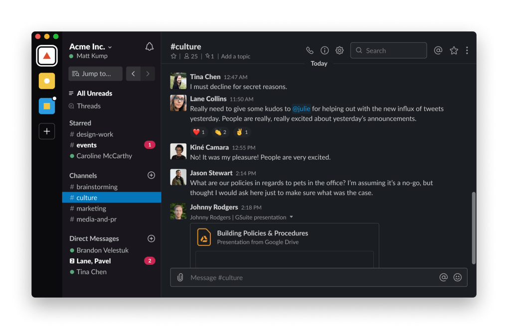
If you’re a dark mode user you might have seen the news: two weeks ago we flipped the switch and gave users dark mode across the desktop app and the browser. We wanted to give you a peek under the hood and some background on the process of getting to this point.
As is usually the case with large codebases, finding an implementation that works is only half the battle; gracefully changing infrastructural code and educating engineers on how to use new tools accounts for much of what we do when working on new capabilities of the product. Working in a large engineering organization — especially within a rapidly growing company — means that every change needs to consider the momentum and roadmaps of many other teams. The overarching question for this project was: how can we build sustainable and maintainable support for themes?
Background
Over the last 18 months, we did a complete rewrite of the desktop client in React. We took advantage of the momentum we had toward a design system and formalized Slack Kit, our UI component library, and along with it some new standards for writing CSS.
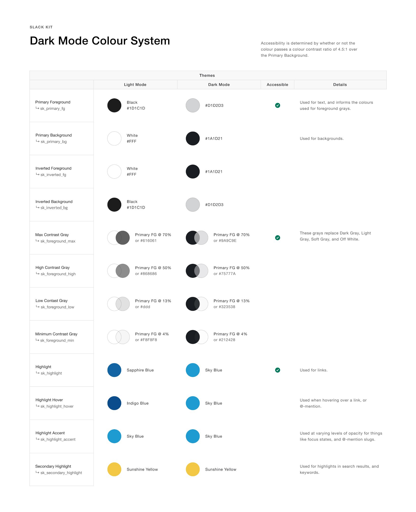
We maintain a set of LESS variables representing our colors and we’ve always known that this would serve as a great entry point to a dark mode implementation — but before we could think about what to build we had to develop a more sophisticated color system that could handle multiple themes.
Redefining the rainbow
Our text color variable used to be called @sk_black and our background color @sk_white. Dark mode is essentially an inversion of the color system, so let’s go ahead and flip those:
// Color assignments in light mode
@sk_black: #111;
@sk_white: #fff;
// Color assignments in dark mode?
@sk_black: #fff;
@sk_white: #111;Not great! Beyond being a confusing reversal, using the terms black and white bias us towards thinking about the traditional light mode experience when what we really want is an abstraction that lets us think about it in any mode. If we orient the variable names around the content rather than the appearance, we get something easier to parse:
// Color assignments in light mode
@sk_foreground: #111;
@sk_background: #fff;
// Color assignments in dark mode
@sk_foreground: #fff;
@sk_background: #111;Using this foreground/background concept we renamed our color system. We changed our link and menu highlight colors to variations on @sk_highlight since they all change slightly in dark mode, but in general we didn’t have to modify our existing rainbow of color values except where they didn’t meet accessible contrast requirements.
The grayscale values were the toughest to get right; after workshopping some options with designers and engineers we settled on four values describing the level of contrast from the background: @sk_foreground_min, @sk_foreground_low, @sk_foreground_high, and @sk_foreground_max. For handling edge cases we created “hard-coded” variables with an _always suffix to denote that the color is theme-agnostic: @sk_black_always and @sk_white_always, along with several grays that use opaque hex values rather than transparency.
Once our stakeholders felt good about the nomenclature, we had to do the unglamorous work of updating the codebase. We wrote a find-and-replace script using Node that looked through each LESS file and replaced old variables with new ones based on a few inferences (whether it was a color or background-color, for instance). We expected the final CSS output in our builds to be exactly the same so we ran diffs between webpack’s generated CSS before and after, ensuring that we would not introduce regressions.
Implementing the idea
CSS variables are a natural fit for this sort of feature; alternatives such as adding component-level style overrides or loading an alternative stylesheet with different variable values risk changing selector specificity and add ongoing maintenance overhead.
We felt it was important to give users a choice between themes irrespective of their OS setting, ruling out the use of the prefers-color-scheme media query directly in CSS; thankfully support was added this year for window.matchMedia(‘(prefers-color-scheme: dark)’).addListener, giving us a hook for OS theme changes at runtime.
Prototyping with these tools gave us a good picture of where we wanted to end up — next we had to audit our CSS to see how we could transition to them as seamlessly as possible. The main roadblock for us was our ubiquitous usage of the LESS function fade, which adds transparency to colors using rgba(). We would need to either deprecate the use of fade or override it with a custom LESS plugin.
We found a solution by defining our CSS variables as a set of comma-separated RGB values rather than fully-defined colors: 26, 29, 33 instead of #1a1d21. This is possible because the var() function in CSS works at the level of tokens, as described by the Editor’s Draft of the CSS custom properties spec:
The var() function can be used in place of any part of a value in any property on an element.
This allowed us to override the fade function with one that would return rgba(var(--sk_primary_background), 0.4) for any call to fade(@sk_primary_background, 40%). There were only a few instances of other LESS color functions in the codebase, making those much easier to deprecate and lint against.
Writing a LESS plugin avoided the problem of closely auditing many thousands of call sites (and corresponding features) and made the existing way of writing styles compatible with the new theming system by default. We shipped all of this work before we started working on the mode toggling behavior so that we could thoroughly QA the client and give engineers a bit more time to get used to the new variable names.
Building the light switch
Dark mode is an unusual feature for us because it expands beyond the scope of a single workspace; our typical methods for storing this type of data rely on user prefs in individual workspaces fetched via API calls on boot. Previously it would have been an issue to use something like localStorage because each workspace was located at a different subdomain, but our recent rewrite keeps everything under the app.slack.com subdomain. This allows us to write to a single localStorage key for all workspaces in a given browser environment and gives us the ability to do some neat tricks around the first paint of the application (which we’ll detail below).
A typical Redux store populated by the localStorage key on boot allows us to access the theme from within React components. In our root React component we pull in the theme and add a body class .sk-client-theme--dark if dark mode is enabled, adding a style that redefines all of our variables:
.sk-client-theme--dark {
  --sk_primary_foreground: 209, 210, 211;
  --sk_primary_background: 26, 29, 33;
  --sk_inverted_foreground: 26, 29, 33;
  --sk_inverted_background: 209, 210, 211;
  --sk_foreground_max: 232, 232, 232;
  --sk_foreground_high: 232, 232, 232;
  --sk_foreground_low: 232, 232, 232;
  --sk_foreground_min: 232, 232, 232;
  --sk_foreground_max_solid: 171, 171, 173;
  --sk_foreground_high_solid: 129, 131, 133;
  --sk_foreground_low_solid: 53, 55, 59;
  --sk_foreground_min_solid: 34, 37, 41;
  --sk_highlight: 29, 155, 209;
  --sk_highlight_hover: 29, 155, 209;
  --sk_highlight_accent: 29, 155, 209;
  --sk_secondary_highlight: 242, 199, 68;
}
Note: You might notice that all of our grayscale variables are identical; as mentioned above, our CSS variables only represent the RGB components of a color, whereas the final color also includes an alpha value. This allows us to fade colors in LESS that are backed by CSS variables at runtime.
Our Slack Kit design system backs all common UI elements, getting us about 90% of the way for free. We audited every feature to fix one-off styles that didn’t use the core color variables and we worked with every feature team to make sure they had the support they needed to make in-progress work compatible with dark mode.
This is where we saw our architectural choices shine: since our other single page apps are built using Slack Kit components in our Gantry application framework (which also puts them under the app.slack.com umbrella), importing the Redux store and adding about four lines of code in a parent component allows all ancillary apps to support dark mode. We were able to add theme support to Slack’s Posts app with a single PR in an afternoon.
The last piece of the puzzle was operating system integration. Giving users the option to turn this on or off (currently a Mac-only beta feature, with Windows support coming soon) meant introducing a second piece of localStorage-backed state, which we called OS sync. This state determines whether or not we’ll pay attention to the result of the window.matchMedia event listener. We communicate both the chosen theme and the OS sync setting back to the desktop app, where it works with native APIs to display the window chrome and context menus in the correct theme.
Smoothing all the edges
Having both pieces of state in localStorage gave us a much-desired capability: painting the app in the correct theme before we have any data. Since the client’s markup is static it does not come with any user data baked in, and waiting for API calls to resolve could take a little while. In the meantime, we’re going to see a flash of white — a side-effect painfully antithetical to the intent of dark mode. To avoid this we wrote some code in the static html file following a simple trick: write styles to the <head> before it is done being parsed, therefore intercepting the page before the first paint.
// an inline script tag in the head
try {
  // read the theme from storage, if it exists
  const currentTheme = localStorage.getItem('slack-client-theme') || 'light';
  // read the current OS sync setting, if it exists
  const osSync = localStorage.getItem('slack-client-theme-os-sync') === 'true';
  // get the OS system theme
  const systemTheme = window.matchMedia('(prefers-color-scheme: dark)').matches;
  // decide which theme to paint
  const themeToPaint = osSync ? systemTheme : currentTheme;
  // if we're in dark mode, write styles to the
  if (themeToPaint === 'dark') {
    const cssRule = 'body { background-color: #1a1d21; }';
    const styleTag = document.createElement('style');
    document.head.appendChild(styleTag);
    styleTag.type = 'text/css';
    styleTag.appendChild(document.createTextNode(cssRule));
  }
} catch (e) {
  // localStorage might be full or disabled... or there's a bug in the code!
}
Now by the time the page is looking to paint something it’s already written and parsed a style tag pointing us to the correct colors. Works like a charm! We don’t recommend writing inline JavaScript this way, but sometimes we have to do what is necessary.
Onward and Upward
Success meant not just shipping a product feature, but making the cultural and structural changes necessary to ensure that dark mode is considered in every bit of work moving forward. Every audience is an important part of this process: frontends and designers, certainly, but everyone from PMs to content writers to executives needs to understand the thinking involved and what support they’ll have moving forward. Throughout this process we gave internal presentations, wrote documentation, reached out to project leads, led extensive QA to audit every square inch of the app, and even built Storybook and Figma plugins that flip components into dark mode — all to ensure that the system we created is sustainable and easy to work with going forward. We feel good about what we’ve built and even better that our customers can finally enjoy the fruits of this labor.
So, what’s next for themes? We’ve left the door open for additional themes like High Contrast, or perhaps even custom themes, if we find the right use cases. And there are still many improvements to make — one issue you may notice is that changing your theme in one browser tab will not change it in the other tabs until a refresh, a problem we could overcome by polling localStorage periodically or when a tab gains focus. We’ll be here listening to customer feedback and continuing to refine our day-to-day tools to make the most out of this new capability.
If this sounds like the kind of project you’d like to work on, there will be many more like it in the months and years ahead and we could certainly use your help!
Thanks to Trish Ang, Alfred Xing, Charles Anderson, Kirstyn Torio, and Cory Bujnowicz for their help with this article and for their outsized contributions to dark mode’s implementation.


