

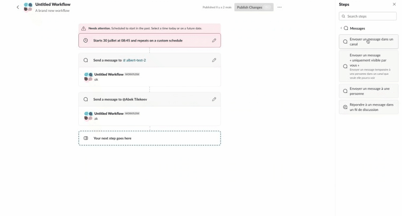
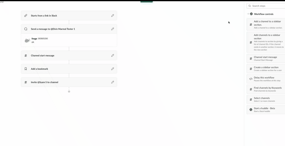
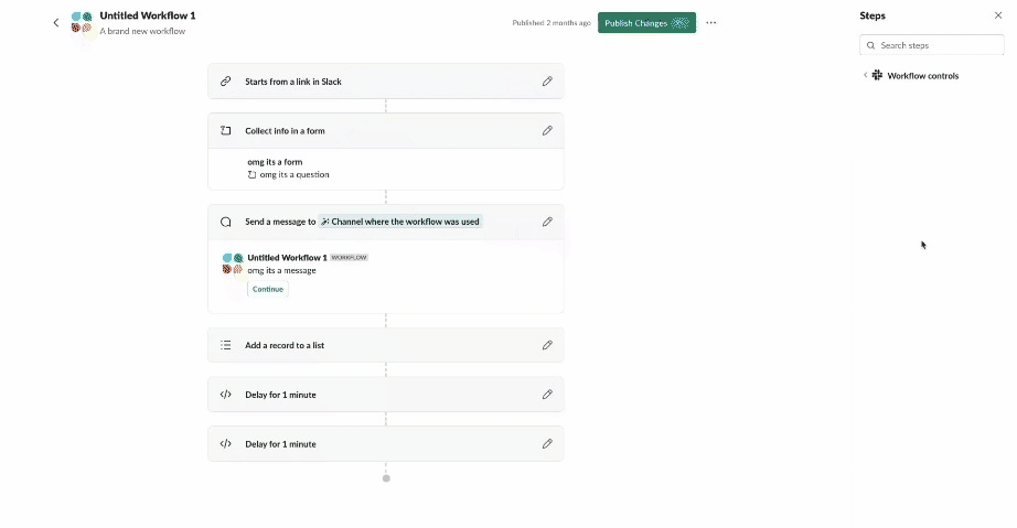
Slack users have more power than ever to automate routine tasks and processes, saving themselves time each day. Workflow Builder, a task automation tool built into Slack, has continued to improve since its launch back in 2019. Along with various new steps and triggers, we built a new sidebar section for all available workflow steps. These steps are now accessible to users without having to open a modal.
The enhancement of the Slack Platform, coupled with smart and significant design changes, makes Workflow Builder a new and powerful experience for users automating tasks in Slack.
Powerful tools can be intimidating, though. On the Workflow Builder team, we identified animations as a great opportunity to create friendly and approachable UI magic. Simple actions, like moving or adding steps, should have a Slack touch — the smooth and fun interaction patterns that Slack is known for.
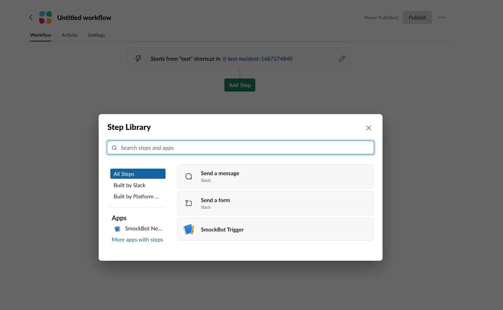
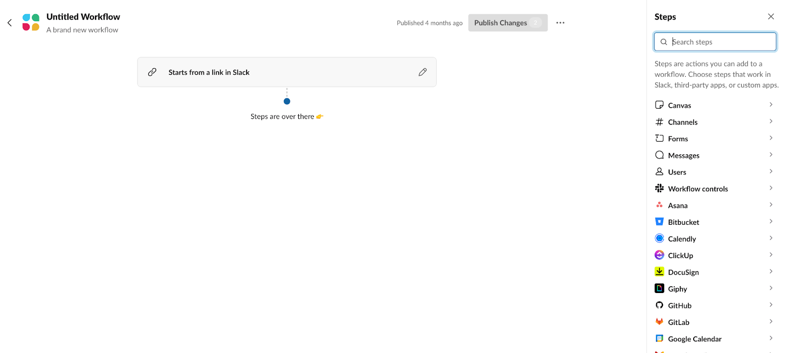
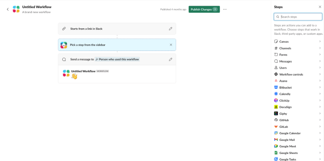
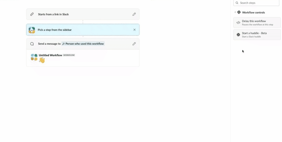
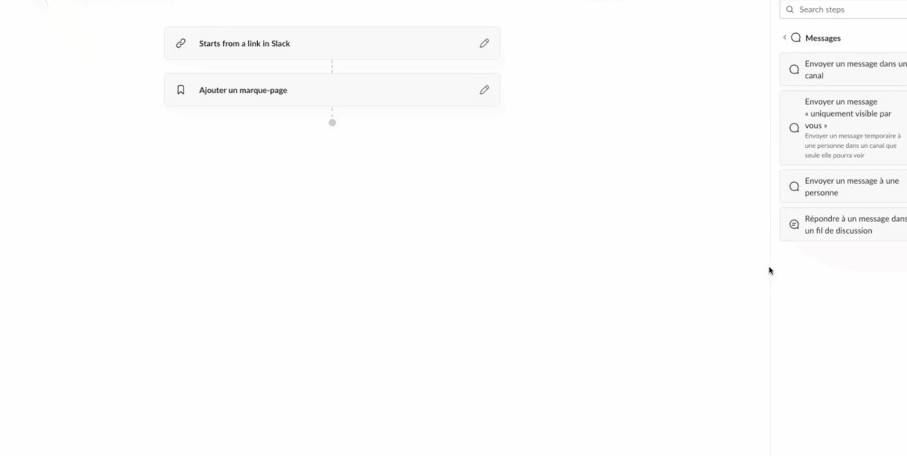
The Workflow Builder experience already had drag-and-drop animations when moving steps within a workflow. But, with the newly introduced sidebar, a drag-and-drop inconsistency was exposed. Why can’t users drag and drop a step from the sidebar into the workflow?
Working with an animation library
Unfortunately, drag-and-drop animations from our new steps sidebar into a workflow were not simple to support.
Workflow Builder uses react-beautiful-dnd — a library that supports drag-and-drop interactions with natural animations. Even though this library is powerful, it is also opinionated and has limitations.
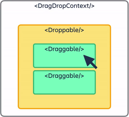
The react-beautiful-dnd library works by wrapping components in a React context. It supports drag-and-drop animations by encasing a list of draggable components in a droppable area. That’s fun to say, right?
- <DragDropContext /> – Wraps the drag-and-drop part of your application
- <Droppable /> – Wraps areas where items can be dropped, and contains
<Draggable />s - <Draggable /> – Wraps items that can be dragged around
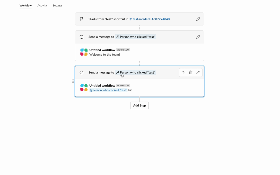
This worked well for dragging and dropping steps within a workflow — we had a singular list of steps and these steps could be moved within the droppable context.
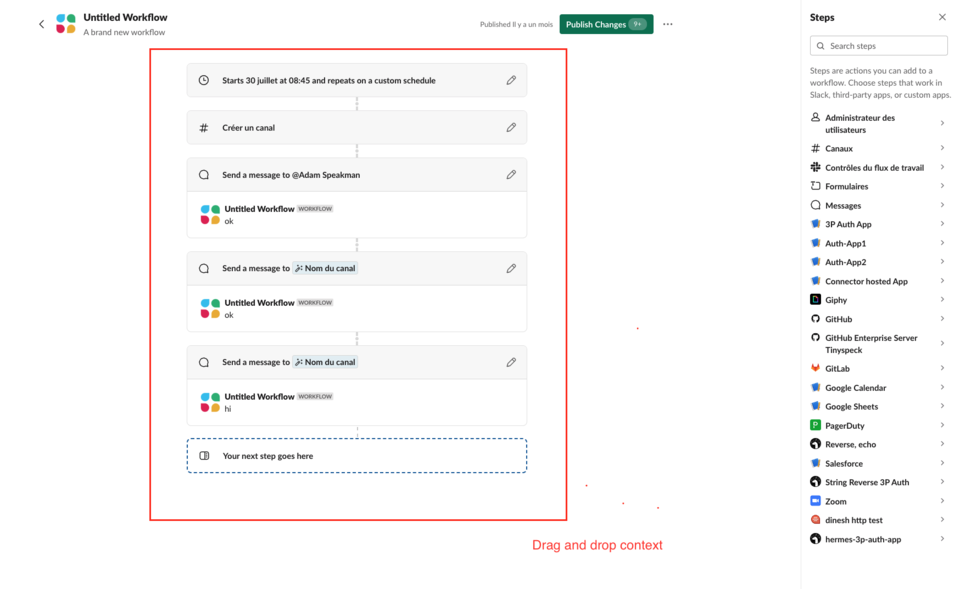
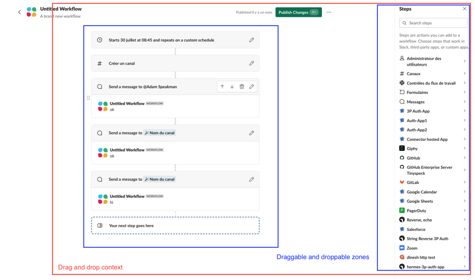
But we needed to rethink that strategy to support drag-and-drop animations for the steps sidebar. Instead of wrapping a portion of the builder, we needed to wrap the entire builder page with the drag-and-drop context, and have two separate lists of draggables and droppables. This would allow for steps to be moved from one list to the other.
Animation value is in the details
Building on the existing drag-and-drop support within Workflow Builder, we were able to get drag-and-drop between the steps sidebar and the workflow steps list working. However, “it works” has never been our quality bar for production experiences. We realized animations should also create a pleasant and encouraging experience. With that in mind, before a public release of the features, we went to the next phase of prototyping — polish.
We learned the value of animations as we found solutions to complicated issues:
- Using context providers and responders
- Fitting drag-and-drop support easily in our codebase
- Working with legacy Workflow Builder components
- Leveraging legacy components for the new Workflow Builder
- Creating custom animations
- Animating the drop of a step into a workflow
- Making dynamic placeholders
- Adding a placeholder when dragging a step over a droppable area
- Solving hint box spacing problems
- Ensuring the animations worked smoothly with existing hint boxes
- Experimenting with a tilt animation
- Creating fun tilt animations as you drag a step
Using context providers and responders
The react-beautiful-dnd library works by using responders. These are “top-level application events that you can use to perform your own state updates, style updates, as well as to make screen reader announcements.” The library required us to maintain the state of drag-and-drop information and to have a centralized place for state-specific actions.
Our custom context provider wrapper was a great solution for this. We stored information about the step being dragged, the destination information, and the location of where the step was being dragged over. Actions — such as what happens when you drop or add a step — were also maintained here. This information was updated dynamically by the provided react-beautiful-dnd responders and maintained in an isolated Workflow Builder drag-and-drop component wrapper.
<WorkflowDragDropContext.Provider value={workflowContexts}>
			   <DragDropContext
				   onBeforeCapture={onBeforeCapture}
				   onBeforeDragStart={onBeforeDragStart}
				   onDragUpdate={onDragUpdate}
				   onDragEnd={onDragEnd}
			   >
				   {children}
			   </DragDropContext>
 </WorkflowDragDropContext.Provider>
Working with legacy Workflow Builder components
The new Workflow Builder frontend is supported by the legacy Workflow Builder components. This was an engineering decision made when we first started building out the new experience. By reusing existing components, we were able to develop quickly, and get things like validation, the step interface, and the trigger interface out of the box. However, supporting legacy workflows while adding features to new workflows was a challenge.
We solved this by dynamically moving the drag-and-drop context. By checking the type of workflow, and if the feature was turned on or not, we could allow both the old and new drag-and-drop support to coexist. Having a thought-out plan for using our powerful Workflow Builder components, and testing thoroughly, was key to the development of new features.
Creating custom animations
Workflow Builder steps in the sidebar are a different size than the steps in the list. This caused a very awkward default drag-and-drop animation.
We created helper functions that modified the original react-beautiful-dnd styling. We used the destination width to translate the position of the dragged step to the middle of the workflow step list.
const translate = `translate(${moveTo.x + destinationWidth - stepItemWidthHalf}px, ${moveTo.y}px)`
The destination width was calculated by the library responders — using onBeforeDragStart in particular. We queried the DOM before dragging occurred and located the droppable destination container to find the width. Our custom drag-and-drop context wrapper worked perfectly to hold this information and was used to update the style.
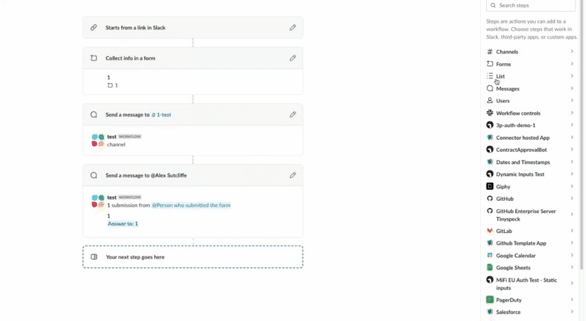
Making dynamic placeholders
After a few iterations, we noticed it was very difficult to understand where a step could be dropped. This posed a huge challenge since react-beautiful-dnd did not support adding placeholders. We needed to be creative to achieve the dragging effect we wanted. Drawing some inspiration, we created a custom segment to dynamically render a placeholder based on where the user was dragging a step.
As drag was being updated, we located the destination DOM element, the dragged DOM element, and the width and height of the placeholder. To find the x-coordinate and y-coordinate, we used the destination index and calculated the position in the DOM. This placeholder size was passed into the drag-and-drop context provider in the workflow step list.
{{      (isDraggingOver || (isDraggingOverLastDroppable &&
	   !isSourceWorkflowList)) && (
			  <div
				  style={{
				  top:
				  placeholderElementSizing.clientY +
				  HALF_DIVIDER_HEIGHT,
				  left: placeholderElementSizing.clientX,
				  height: placeholderElementSizing.clientHeight,
				  width: placeholderElementSizing.clientWidth,
				  }}
				  />
					  )}
Solving hint box spacing problems
Workflow Builder has many moving parts and one of those is hint boxes. When a user clicks in between steps, a hint box appears and prompts the user to add a step. This is helpful but it was causing issues with drag-and-drop. Showing the placeholder while dragging caused spacing issues because it is technically not a step. Additionally, it did not make sense to see the placeholder while the user was trying to move the step to a different position.
The clear solution was to remove the hint box while dragging. This required an in-depth knowledge of the difference between state updates with onBeforeDragStart vs onBeforeCapture responders. We initially tried to reset the placeholders with the onBeforeDragStart responder.
  const OnBeforeDragStart = useCallback(
       () => {
           // Before dragging starts reset the
           // hint box to avoid awkward spacing
           setHideHintBox(true);
       },
       [dispatch]
   );
We quickly realized this would not work. The state was not updated in time. React-beautiful-dnd DOM detected the placeholder’s existence even though it was not there, causing noticeable spacing problems.
We replaced the onBeforeDragStart responder with onBeforeCapture. The difference between these responders is that onBeforeCapture supports modifying the DOM before any calculation occurs. Hiding and resetting the hint box before the dragging action allowed us to create a better user experience and solve our problem.
Experimenting with a tilt animation
Animations can always be enhanced. Adding a tilt was a design decision that was initially a prototype. Our designer, Kyle Tezak, had a fun idea to add a tilt to the step when dragging. Working closely with an engineer and the Design Technology team, we created a proof-of-concept prototype. This was demoed to the team and everyone loved the idea — why not make a repetitive action exciting? We knew we had to share this with our customers.
We created a Natural Drag component that took a style object and modified the rotation based on how fast the user was dragging. We added this animation by using the requestAnimationFrame window method and created a smooth tilt effect that lasted as long as the user was dragging the step.
const newStyle =
		   snapshot.isDragging && !snapshot.dropAnimation
			   ? {
					   ...style,
					   transform: modifiedAnimation.transform,
				 }
			   : style;
What animation taught our team
Animation in the Workflow Builder became our opportunity to spotlight powerful, new features. Over countless iterations, we fine-tuned the drag-and-drop UI to be a pleasant and productive experience for power users and new users. We learned a lot of engineering lessons along the way — especially around finding creative ways to work within a complicated codebase. These challenges paved the way for new design and engineering animation capabilities in the builder.

At Slack, craft is central to every aspect of our design and engineering life cycle. It’s the small things, like making adding steps feel fun and smooth, that give you the confidence to explore new features and want to use them again. Dedication to craft and investing in small, delightful interactions all add up to make work simpler, more pleasant, and more productive for our users.
We're hiring; come work with us!
Apply now