

Hi everyone!
My name is Trish, a.k.a. @feesh on the internet, and my pronouns are she/her. Presently, I’m a Front End Engineer at Slack, where I work on our internal design system and component library, called Slack Kit. More specifically, I work with fellow engineers to build React components that comprise the foundational layer of our Slack client, and help to ensure this base layer of components are fully accessible.
I’ve been working in the industry as a front end engineer for a bit over a decade at this point, and if there is one thing I am familiar with, it’s failure. But, I’m here to tell you, that’s okay! Failure is normal: everyone fails sometimes, and then we learn, and then probably fail again in an equally spectacular way and learn again. It’s a cycle we all go through, and it’s how we grow as humans.

If you’re also a front end engineer, I’m sure you’re equally familiar with this feeling of failure. Browser rendering inconsistencies often feel like you’re in the wild west, web compilers behave like a black box of nightmares, and then there’s that dreaded finishing step of any web project: accessibility.
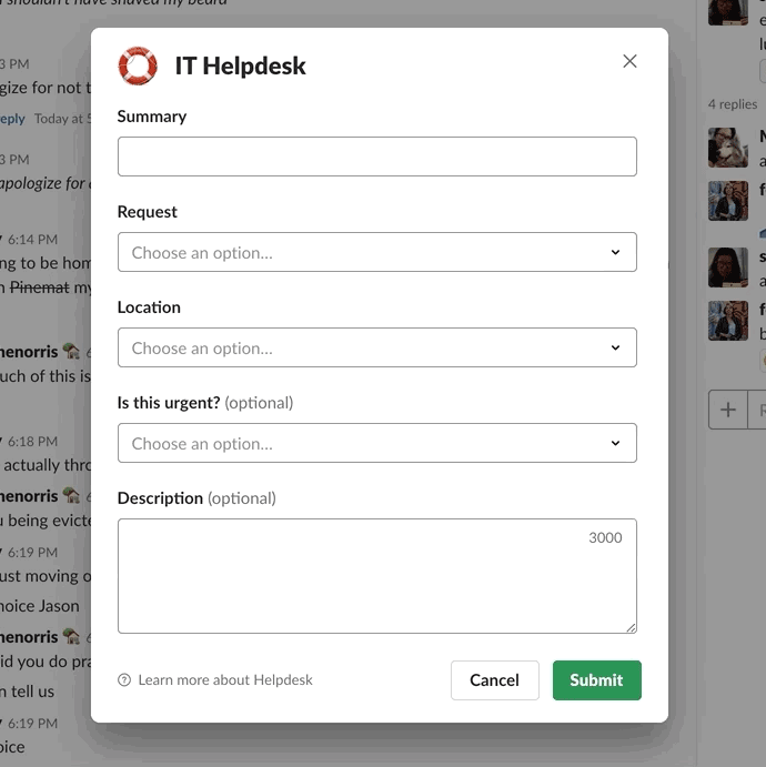
Allow me to share a personal story of failure. A little over a year ago I was preparing to launch my first big feature in Slack. I felt like I was on top of the world, this new tool I’d spent months on would roll out to all the folks who use Slack to help make their working lives simpler, more pleasant, and productive. And then, I got a message like this:
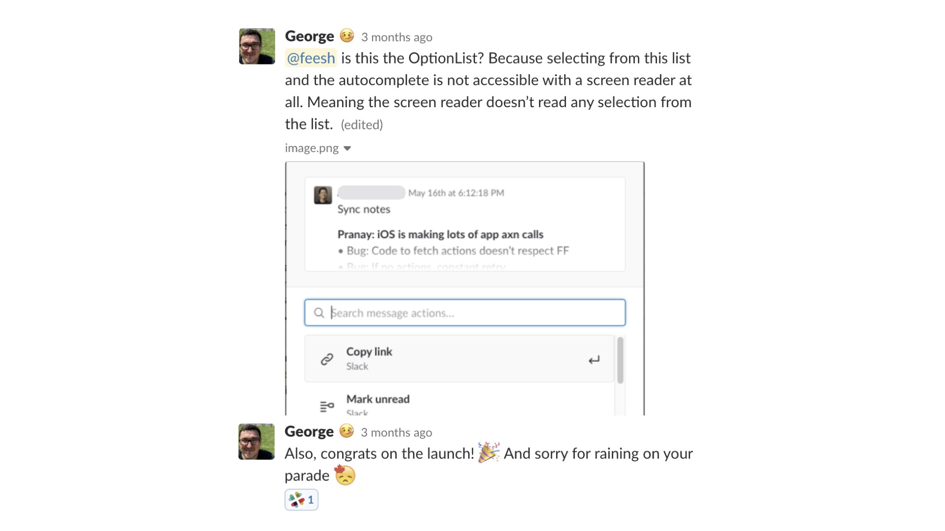
It was really hard for me to not feel like a failure at this point. But, I’m proud to say that at Slack, we treat accessibility bugs as broken functionality, and product blockers. If your website is inaccessible, that means that real humans on the internet cannot use it. And for Slack, where we have over 10 million users daily, being unable to communicate with your teammates, interact with content, or being blocked from doing your work is simply unacceptable.
I’ll be honest, I’m not an accessibility expert. Luckily, this message showed up after an internal launch, flagged by our incredible accessibility team, and was just letting me know that I had a lot more to learn and a little more work to do. Since this time, I’ve learned a ton about the complexities of screen readers, building for inclusivity, and creating accessible experiences. I’m not an accessibility expert, but as it turns out, you don’t need to be to do this work.
So, let’s flip the script, and dive into — “How not to fail at accessibility”
We’re going to cover three main areas:
- Testing — how do you know if your website is or is not accessible currently?
- Building — once you’ve identified some bugs, how do you code for accessibility?
- Process — how can you improve your process to prevent bugs in the first place?
Testing
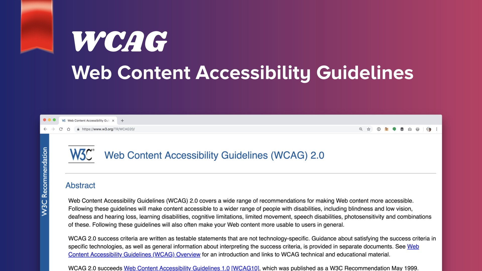
What does accessibility on the web even mean? It is very broadly scoped, but thankfully also thoroughly documented. The W3C established what is known as the Web Content Accessibility Guidelines, or WCAG. If you check out this lovely doc, you’ll find everything you’ve ever wanted to know about web accessibility in a lengthy format.
These guidelines break down accessibility compliance to three grades: Levels A, AA, and AAA, with specific criteria for each on what is or isn’t WCAG compliant. Each level defines stricter adherence to supported accessible functionality, with Level A being the lowest level of compliance, and Level AAA being the most strict. At Slack, we aim to meet Level AA for all of our features, and for Level AAA compliance wherever possible.
The spectrum of human abilities and the technology to support them is infinitely broad, and there are complexities that even these guidelines don’t properly address. For now, we’ll get you started on four areas you can test now — the Hello, World of accessibility, if you will — and I’ll let you dig into more nuanced support later. These four areas are: color contrast, user interface zoom support, keyboard interaction models, and screenreader support.
🌈 Color Contrast
When looking at contrast, we’re not evaluating every last color across your beautiful website: instead we’re interested in making sure the information and interactive elements on your website are perceivable and understandable. That means, specifically, the body copy, large text (meaning anything bold 14pt or 18pt non-bold and up), and UI elements on your website, such as iconography and form elements.
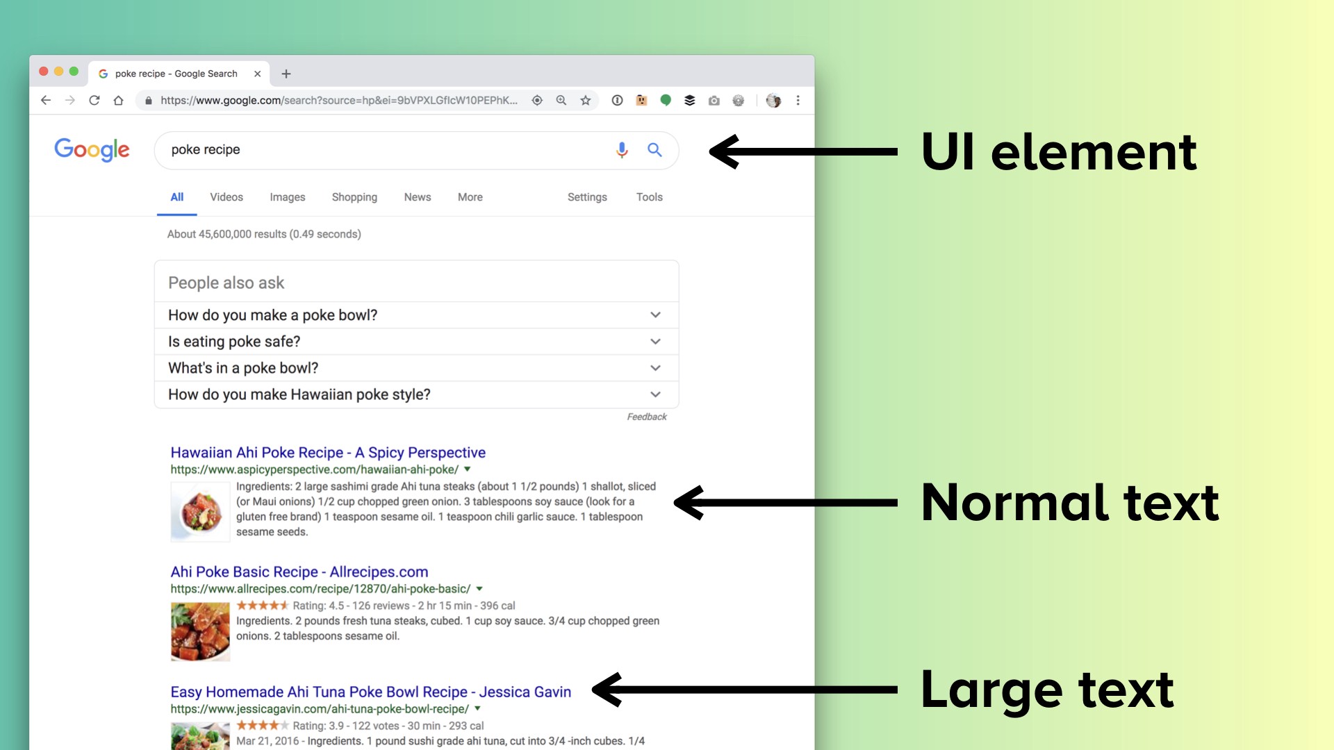
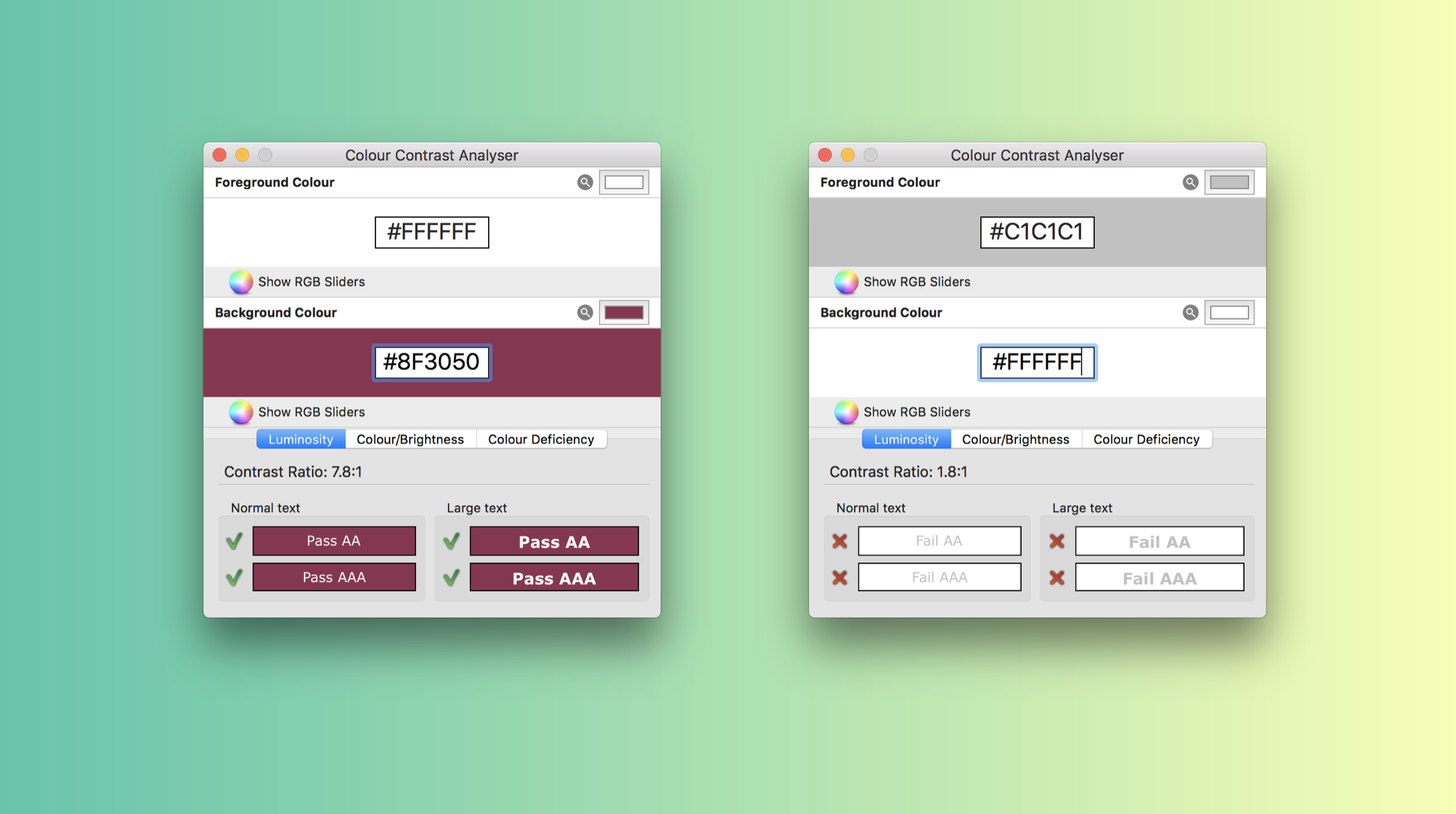
The best tool for the job here is the Colour Contrast Analyzer, which lets you use an eyedropper or hex code to check foreground and background colors, and will immediately tell you whether or not you meet the criteria at the bottom. It should come as no surprise that light gray text on a white background does not meet the contrast requirement.
🔎 User Interface Zoom
UI Zoom refers to the browser’s built-in zoom functionality that is toggled using CMD or CTRL +/ -. At Slack, our designers provide mock-ups at the different zoom levels we support whenever relevant. The easiest way to go about testing this is to simply zoom in a few levels and spend a day or two looking for broken areas in your interface.
⌨️ Keyboard Navigation
Also known as the Keyboard Interaction Model. This refers to navigating your web content using only a keyboard, most commonly using the Tab and Shift + Tab keys to move forward and backward, and using Arrow keys, Enter, and Esc to interact with UI elements.
Every year in May, our accessibility team hosts a week-long challenge for Global Accessibility Awareness Day where they encourage us to put our mice away in our desk drawers, and spend the week using Slack only by keyboard. I remember trying this last year and finding both how many ways I was able to be more efficient, and also ways where I struggled because I didn’t know what the different common patterns are.
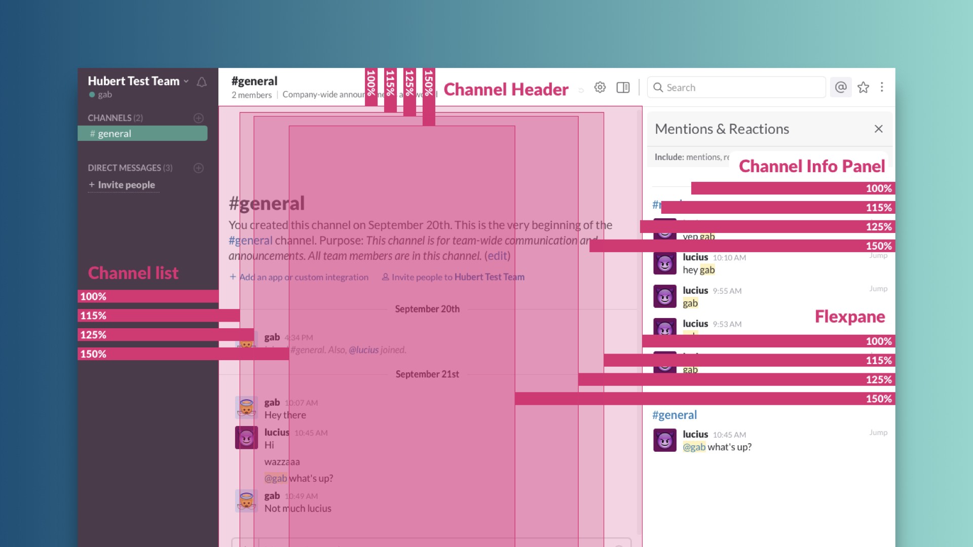
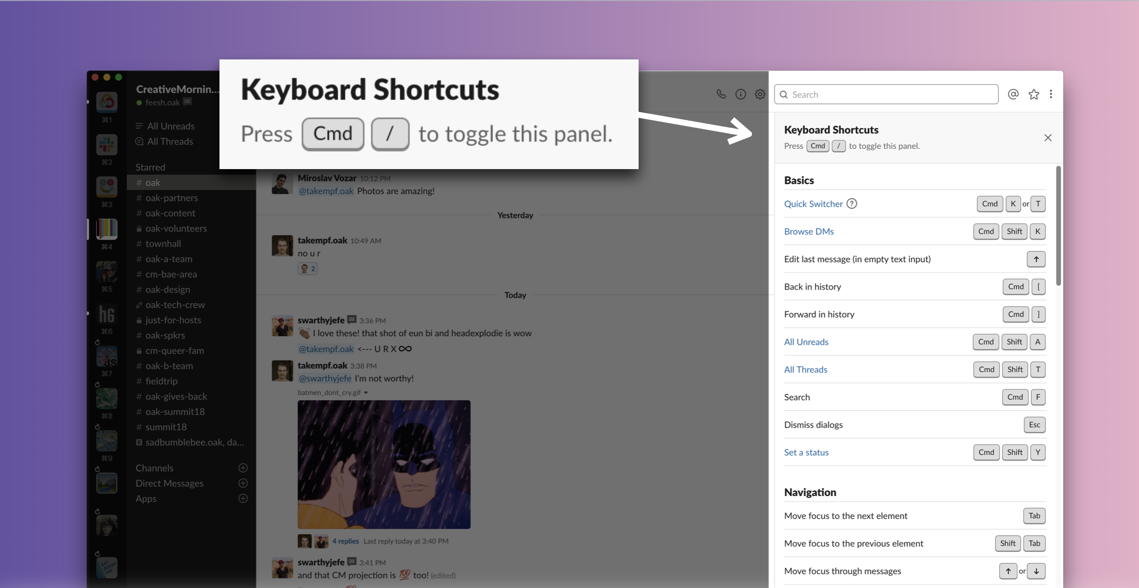
Within the Slack client, we provide this handy palette of key commands to help folks who may have mobility limitations, and also to enable people to become power users of Slack.
In addition to keyboard-support, accessibility guidelines require that you indicate what has current focus, visualized here by a fuzzy blue ring.
An important thing to look out for while you’re testing out your interface is if you notice that you’re able to tab into a section, but then are unable to tab away from it. These are known as keyboard traps and should be avoided.

💬 Screenreader support
If you’ve fixed up your keyboard interaction model, you’re already halfway there! Screenreaders are a type of assistive technology that audibly dictate what a user is currently interfacing with, particularly useful for folks with low or no vision.
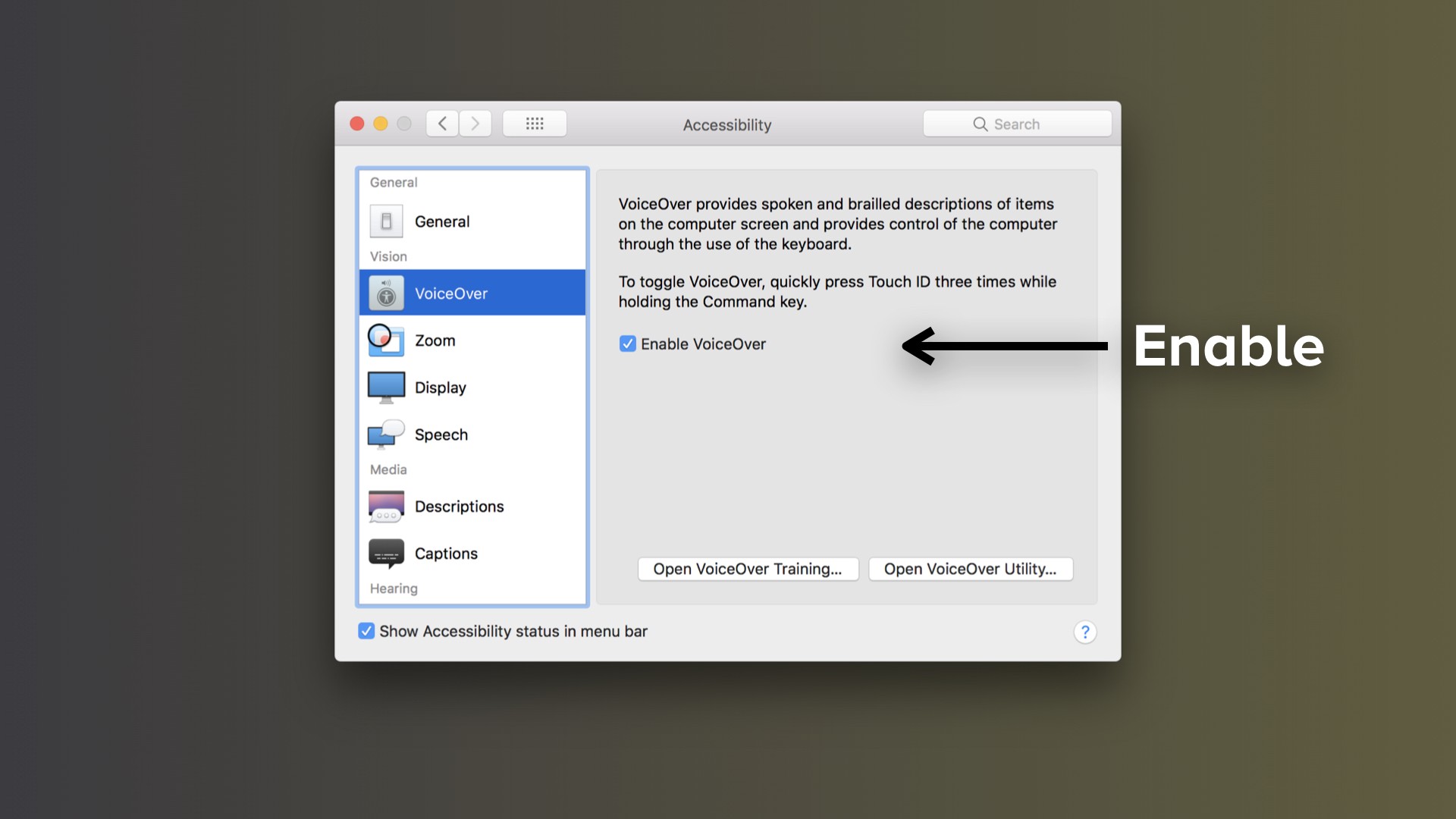
If you have a Mac, screenreader software is built in with VoiceOver. To turn this on, open up Systems Preferences, navigate to the Accessibility tab, and enable VoiceOver. There are equivalent free software options for PCs as well, such as NVDA.
Here’s a quick preview for what it’s like using a screenreader: you’ll notice as the keyboard focuses on an element, the screenreader will first announce what type of element it is, how it’s defined, and then will update as you’re interacting with it. Can you guess what interface this is just by listening?
Additionally, screen readers use what’s known as a rotor for quickly navigating around sections on a webpage. This is one of the reasons to make sure you’re using well-defined and semantic HTML markup to begin with, as that’s how the rotor indexes your content. You can pull the rotor up using Control + Option + U, and move left or right to access the different menus available.
Building
Now that you’ve identified a few areas you want to clean up, how do you improve your code to provide accessible experiences? Once you start building, there are three broad-level things to consider. For screenreaders, you’ll need to provide proper HTML and ARIA markup. You’ll get very, very comfortable with programmatic focus management. And you can leverage modern coding practices like variable usage and managing state to help as well.
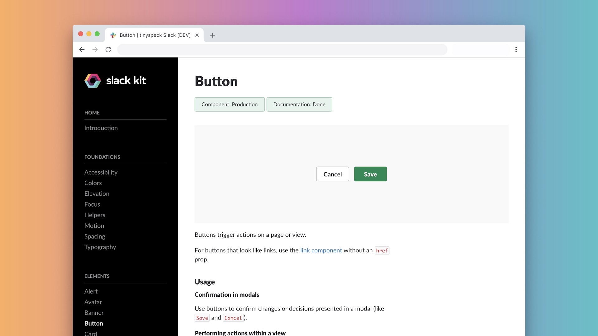
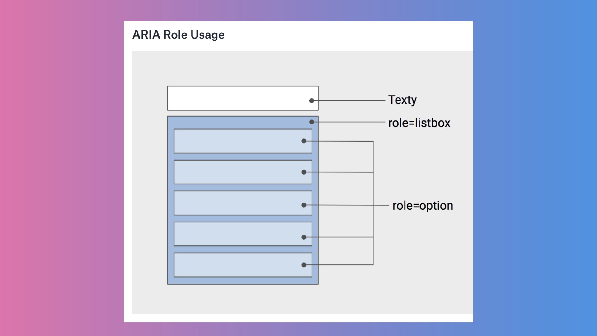
Let’s step back to that earlier call out from George. The feature I worked on involved a fairly common interface: an input box with an associated list, that would be filtered with whatever is typed into the box. This is known as a combobox.
Taking a look at the before and after results, can you determine what’s different here? You still have a box, and a list below it. The issue here was that I approached it exactly as it sounds: I used a Text Input, and then below it, I used a List Menu component. To me, it was clear that even though there were two components involved, they were related: they both had a similar style and typography, they were united closely in composition, and were contained by a box with a white background. Simple, right?
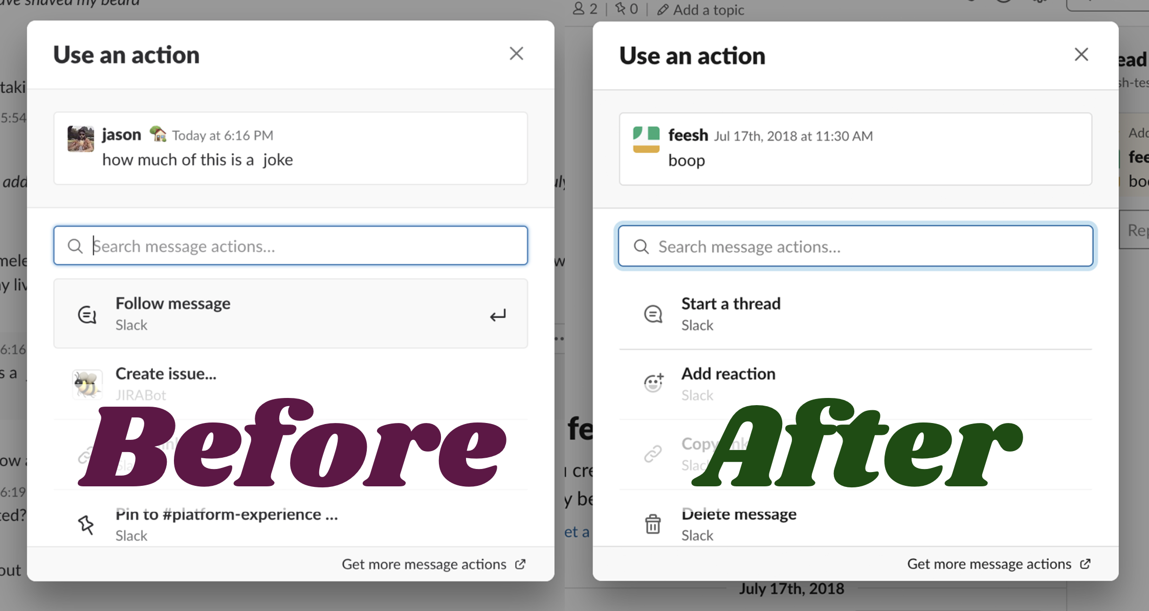
The problem here was in that initial assumption. Even though to me they were visually distinct as related elements, it turns out that screenreaders do not have the benefit of those visual clues. Instead, to a screenreader, they were two distinctly different components.
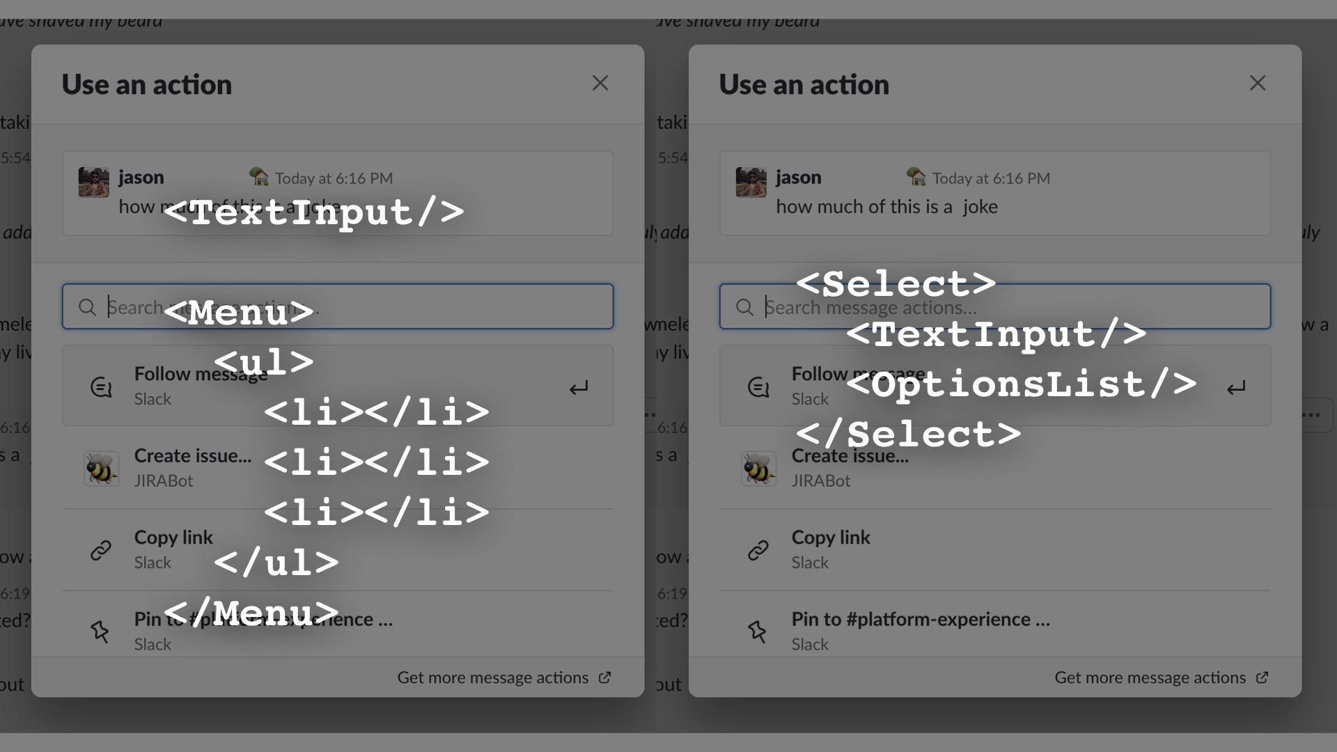
In order to fix this, I needed to switch to an entirely different underlying architecture: instead of two components, we now have one component, a Select, which internally has measures to connect the input and it’s associated list of options. Much like your keyboard, screenreaders can only maintain focus on one component at a time. This way, the screenreader remains focused on the container Select, and both internal components update their parent while someone navigates the list or types in the box.
But, how does that work, you might ask?
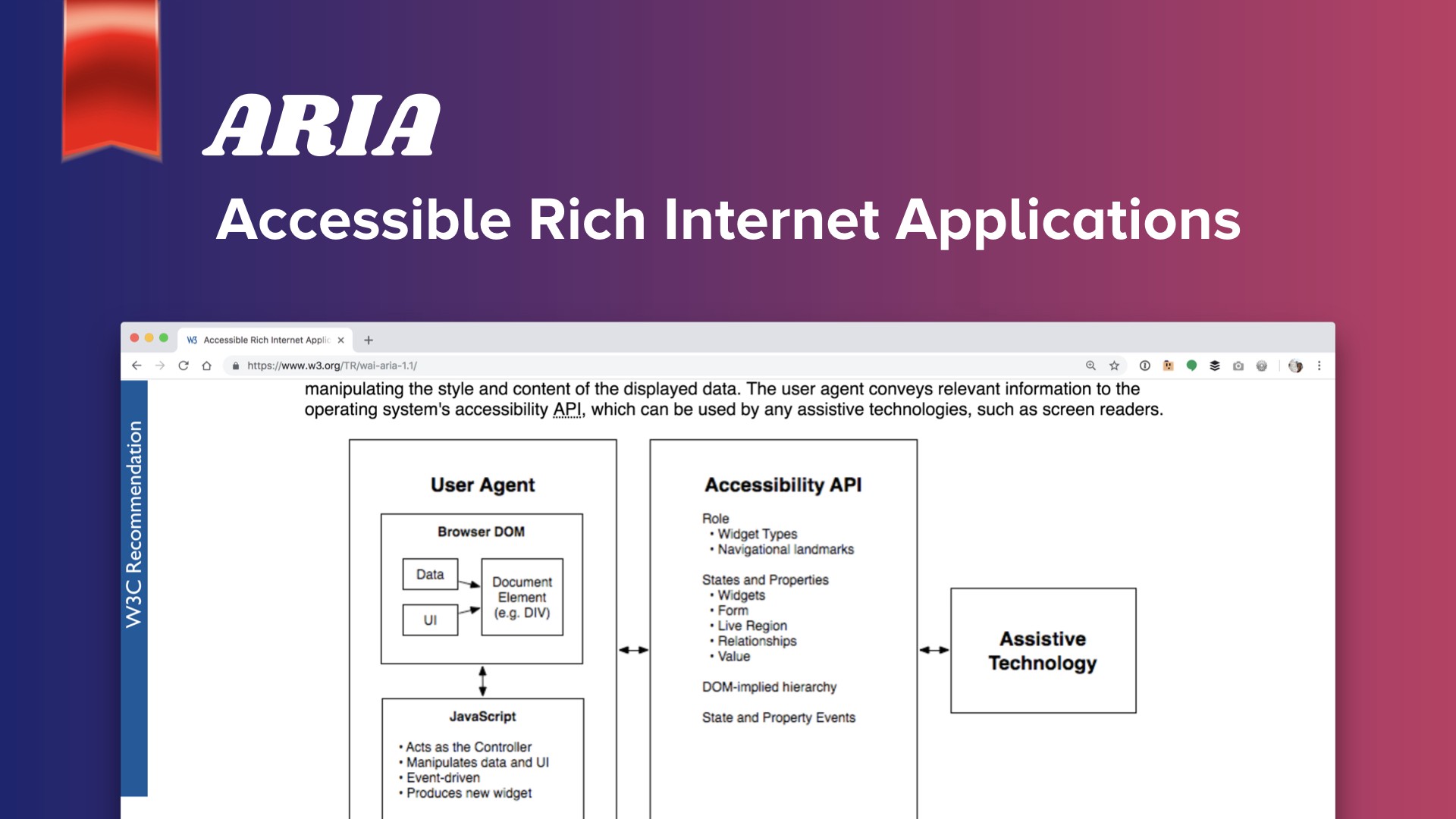
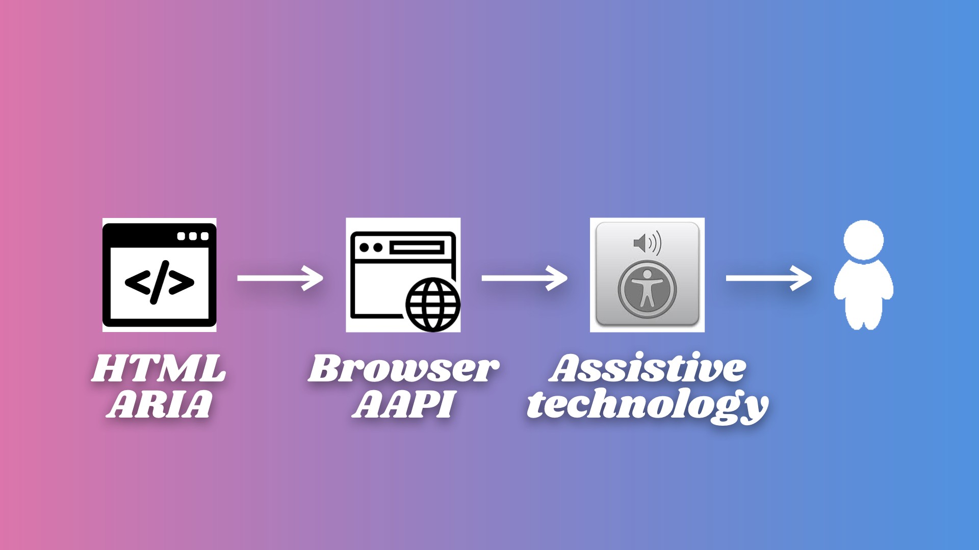
Back to that handy W3C document. They’ve defined an API for indicating to assistive technology what is happening on screen, known as ARIA, or Accessible Rich Internet Applications. What’s going on behind the scenes is that this accessibility API parses the DOM on your website, communicates that to the screenreader or whichever assistive technology, which then outputs the information to a user.
Just in the same way that browsers are inconsistent with how they may render CSS, it’s the same with how each browser interprets ARIA labels. This is no problem, just continue thoroughly testing your web content across multiple browsers and platforms as I’m sure you all already do.
We’ve learned to build out an ARIA pattern with all of our tech specs, so that we know before we start coding anything that our component should be accessible from the beginning. This is not always easy though, since many of our components need to support many different use cases, sometimes building that out looks a little more like this. Just be sure to workshop it with your peers to make sure you’re covering all your bases.
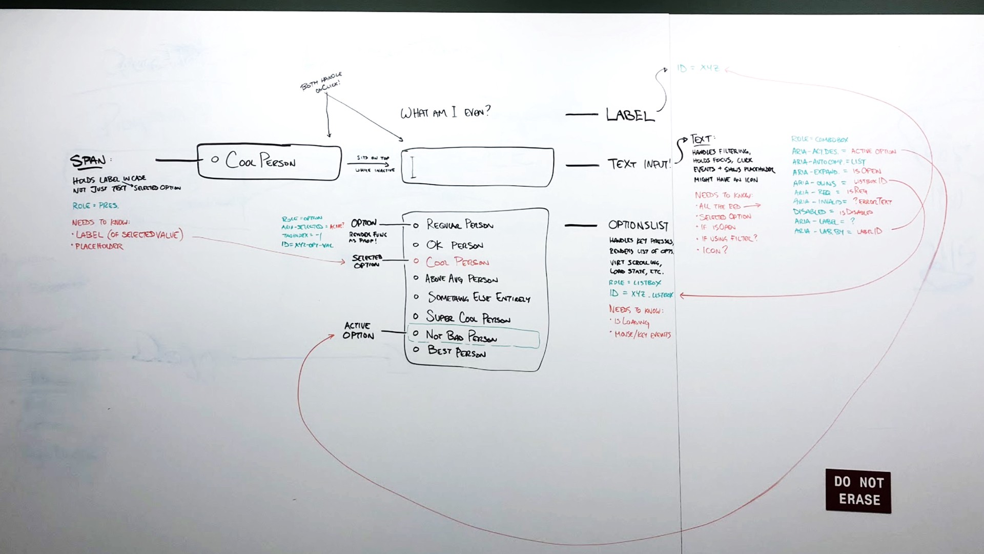
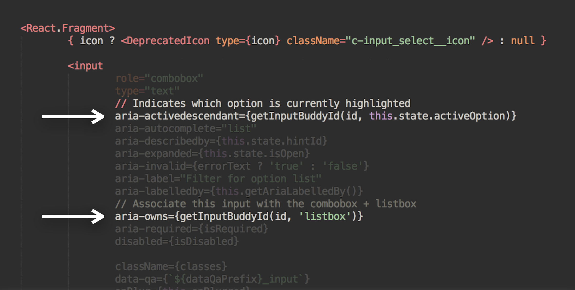
Once you finally get to the code level, things start looking a little more like this, where you may have a feature spread out across a few components, and can use Javascript utilities to build and connect the IDs that are informing your ARIA attributes. For a more concrete example, here’s the finished combobox where it reads the proper content.
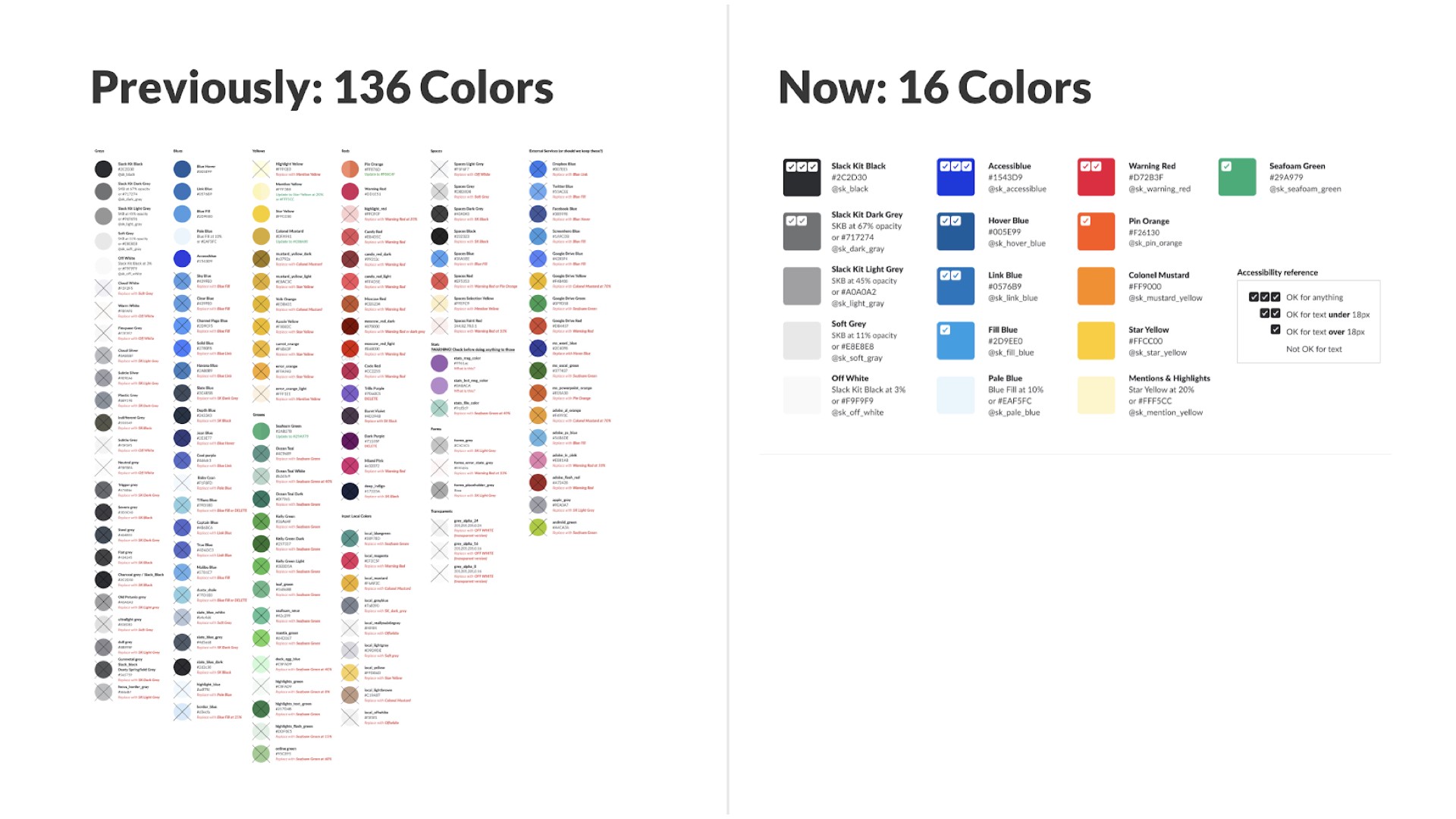
Building an internal design system at Slack has helped us formalize additional best practices around a consistent code base. For example, last year we undertook the massive task of auditing all of our existing colors throughout the code base, simplifying, ensuring they were all compatible, and then setting up linters to prevent any additional one-off colors. This is just one of the steps we’ve done to help prepare for dark mode, and to ensure that it’s still fully accessible.
Process
How do you improve your process to prevent bugs from creeping in in the first place? Let’s step back to what things looked like over a year ago at Slack.
A bit after I joined, we had around ~75 front end engineers. But amongst them, we only had one accessibility expert. As I mentioned before, I am not an accessibility expert: we have the famed Todd Kloots, who is incredibly talented and amazing to work with. However, as skilled as he is, it became very clear that with all the accessible features we wanted to build out and support, one front end alone was not enough to do it.
So over the course of the past year, we’ve rolled out training similar to this to ensure that all front end engineers at Slack understand what accessibility criteria are, how to test for it, and how to build these best practices into their feature development. More importantly, this means that we’re equipped to test each others’ features through code reviews.
We’ve even gone a step further and now ensure that even at the designer level, the entire team knows what accessibility is and how to design for it. Our designers now provide articulated keyboard interaction models when necessary. We even enlist our product writing and internationalization teams where possible, to ensure the content being output to screen readers is clear and comprehendible to users no matter where they are.
Through the development phase, having our front end team utilize a centralized design system means the components they use are accessible by default. At this point, we have Slack Kit components used in 75% of applicable areas of our codebase. And where folks are developing those components from scratch, we require them to write out a tech spec including accessibility considerations, and we check in regularly with our accessibility expert, Todd, throughout the build process. The single most useful thing I’ve learned about accessibility is to consider it as early on in your process as possible: as someone once said, it’s easier to add the blueberries in before you’ve baked the muffin.
Finally, as we’re preparing for launch, we’ve got a dedicated QA team to thoroughly test for accessibility, in addition to a third party service, Ultra, that conducts an audit as well.
Even if your company doesn’t have the benefit of a component library, design system, or QA team, hopefully this Starter Kit enough to get you started to become your own resident expert, and to keep learning more about what is possible.
In summary
Awesome, nice job everyone! You’ve learned a ton and are ready to apply all these best practices to your own web content.
I want you to stop for a minute and think about everything you did while browsing around the internet today. Let’s say you woke up and checked a weather website to decide how you should dress for the day. Then maybe you checked out Twitter to catch up on what’s happening. You might have seen an interesting new Javascript meetup happening soon, so you clicked on over to their website, read the description, and then bought a ticket. Then perhaps you needed to look up a great restaurant nearby to celebrate a friend’s birthday after work.
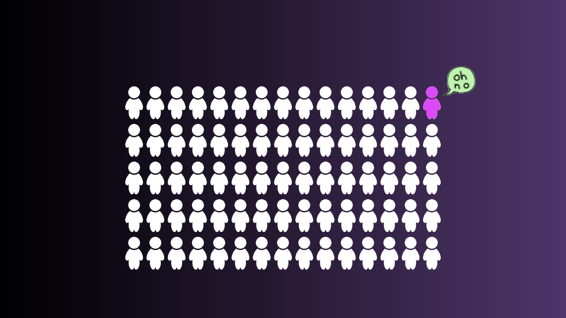
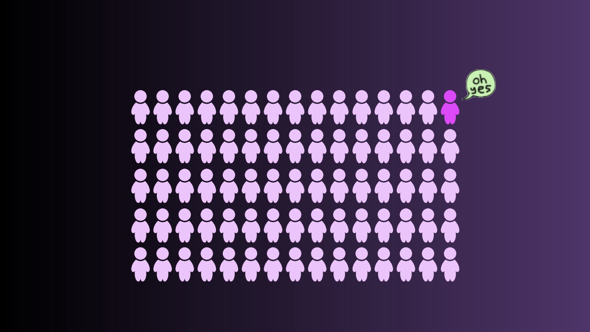
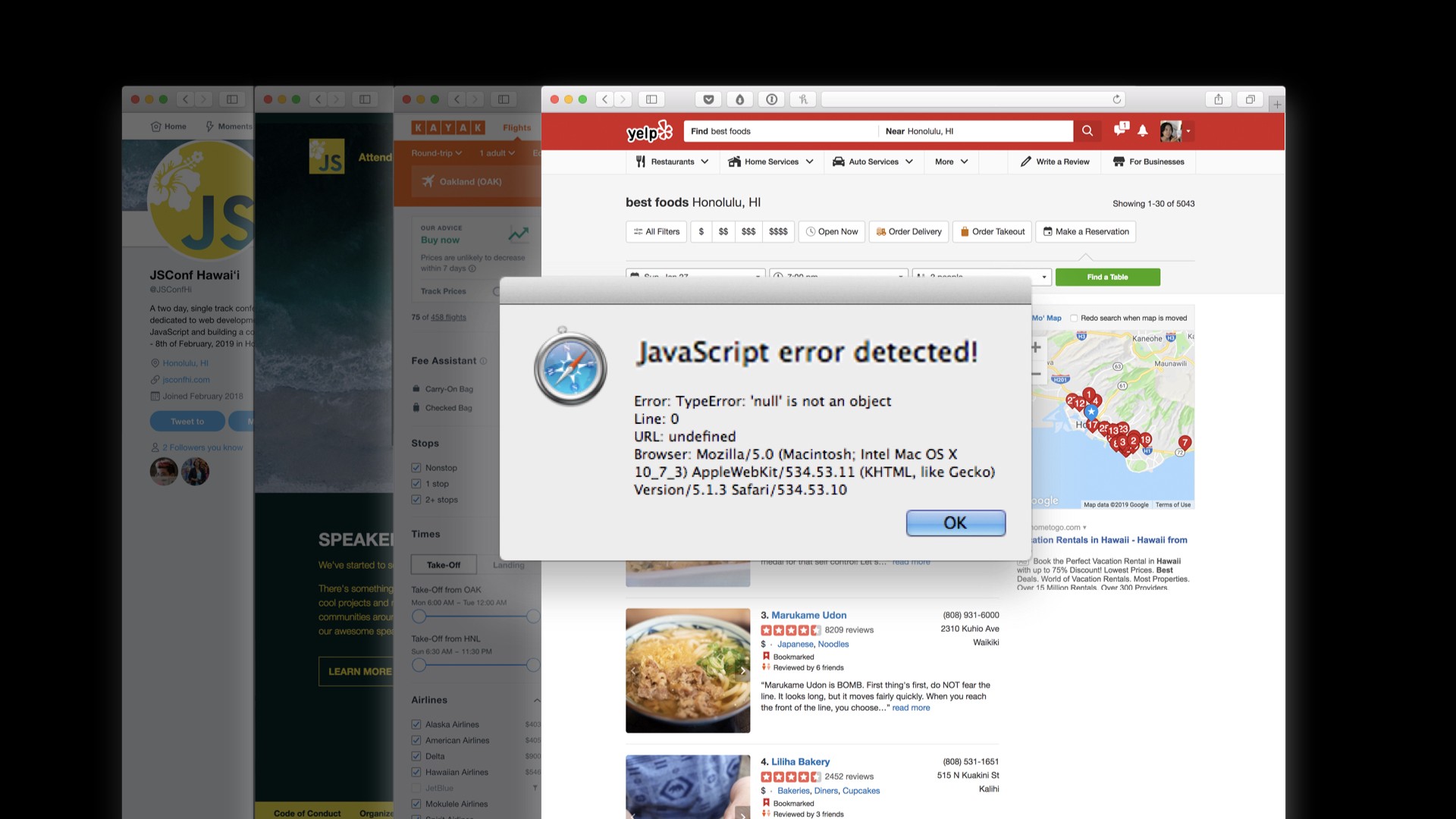
A recent study in the UK found that around 70% of all websites did not meet accessibility standards. Can you imagine if, as you were perusing the internet, looking up information and filling out forms, 70% of the time you hit a Javascript error and were unable to continue? I don’t know about y’all but I would feel incredibly frustrated and would probably hate using the internet.
I’ve always found it interesting that other engineering professions undergo strict certifications and testing, for example civil engineers need to be certified to ensure the bridges and buildings they help build are safe for humans to use. While I don’t want that type of gatekeeping behavior in our industry, I do want us to hold ourselves and each other more accountable to being responsible with our code: we should be making the internet safe for all humans to use, too.
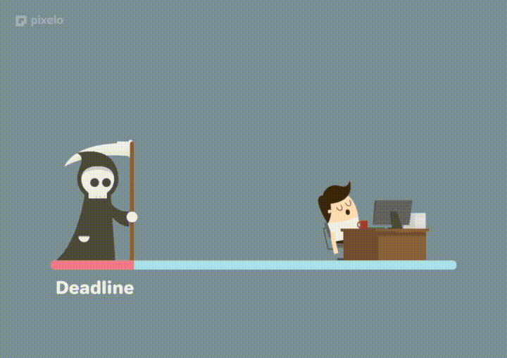
I hope that this is something you all remember as you’re doing your day-to-day work, and especially the next time your manager or PM is breathing down your throat about a deadline. Your peers are trusting your expertise in all-things front end, and that includes knowing that you need to make your products accessible, because even though it takes a little more time up front, it will ultimately save you infinitely in the long run.
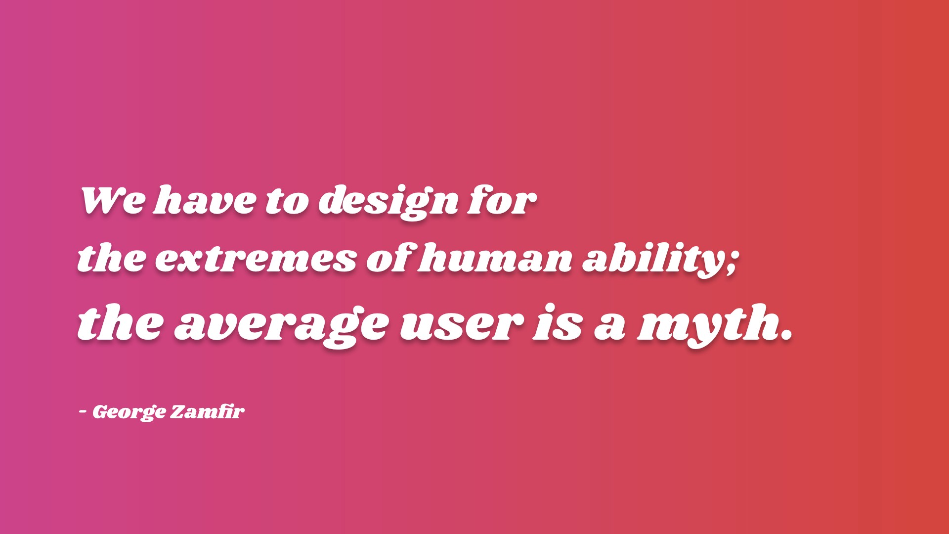
It’s become more and more apparent that there are no average users, this is a myth. Instead, we should design for the extremes of human ability. Much like everything, prioritizing inclusivity and designing for the most marginalized groups actually makes a better experience for everyone.
There are countless examples of how technologies or products developed originally for folks with disabilities are helpful for everyone: if you think about the last time you used closed captions while watching a video in a noisy cafe, or even if you enjoy text messages or using Siri, all of these have their roots in assistive technology.
So I hope you’ll all take this as a sign that you can build for accessibility, and if you get stuck along the way, want to chat about your favorite accessibility bug, or are interested in coming to work on our internal component library at Slack, check out our available positions or hit me up @feesh on the internet! Good luck everybody!
- Excited to get started? Check out this accessibility starter kit!
- Want to join our team? Check out the open jobs at https://slack.com/jobs


