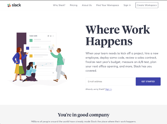
In August, we released a major redesign of slack.com, and we want to give you a peek behind-the-scenes. Rebuilding our marketing website was a massive project that took careful coordination across a variety of teams, departments, and agencies.
We implemented a redesign while overhauling all the under-the-hood code. Our aim was to address a few goals at the same time: deliver a consistent rebranded experience while tackling critical improvements to site architecture, code modularity, and overall performance and accessibility. This would afford us a new foundation for several important company initiatives, including internationalization.
Slack.com (L-R: January 2017, August 2017)
Cleaner and leaner code
The old slack.com shared many code and asset dependencies with our web-based Slack client. One of our earliest goals was to decouple the website from the “web app” in order to streamline and simplify our codebase. By including only what we need to run slack.com, we are able to increase site stability, reduce developer confusion and create a codebase that is easier to iterate on. A fundamental part of this effort was the creation of our new UI framework, called Spacesuit.
The Spacesuit framework consists of class-based, reusable components and utility classes used to standardize our marketing pages. It allowed us to reduce our CSS payload, in one case by nearly 70% (from 416kB to 132kB).
Some other interesting data points:
- 799 unique declarations, down from 1,881
- 14 unique colors, down from 91
- 1,719 selectors, down from 2,328


Our CSS is organized based on the ITCSS philosophy and uses BEM-like naming conventions. Selectors are named using a single-letter prefix to indicate the type of style the class represents. The prefix is followed by the name of the component and any variation applied to it. For example, u-margin-top--small represents a utility class that sets margin-top to the small value set by our variables. Utility classes such as these are an essential part of our system as it allows our devs to fine tune pieces of UI without having to rewrite a lot of CSS. In addition, spacing between components is one of the tricker parts of creating a design system. Utility classes such as u-margin-top--small let us create consistent spacing and eliminate the need to reset or undo any spacing already applied to a component.
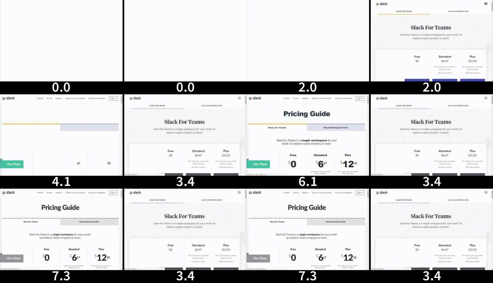
A modern, responsive layout
The new site uses a combination of Flexbox and CSS Grid to create responsive layouts. We wanted to utilize the latest CSS features, while also ensuring that visitors with older browsers received a comparable experience.
At first we tried to implement our layout with a traditional 12-column grid using CSS Grid. That approach ultimately didn’t work because we were limiting ourselves into a using a single dimensional layout when Grid is meant for two. In the end, we discovered that a column-based grid wasn’t actually needed. Since Grid allows you to create a custom grid to match whatever layout you have, we didn’t need to force it into 12 columns. Instead, we created CSS Grid objects for some of the common layout patterns in the designs.
Some of the patterns were pretty simple.

Others were more complex, which really showcased Grid’s abilities.
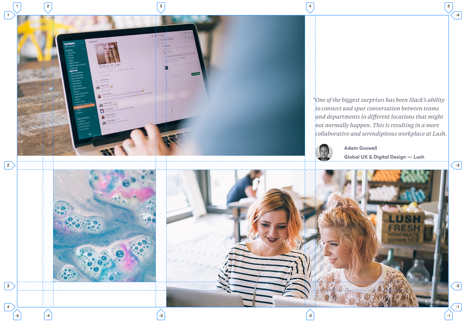
Before our Grid implementation, a layout like the one above required lots of wrapping, and sometimes empty, divs to mimic a two-dimensional grid.
<section class=”o-section”>
    <div class=”o-content-container”>
        <div class=”o-row”>
            <div class=”col-8">…</div>
            <div class=”col-4">…</div>
        </div>
        <div class=”o-row”>
            <div class=”col-1"></div>
            <div class=”col-3">…</div>
            <div class=”col-8">…</div>
        </div>
    </div>
</section>
With CSS Grid, we’re able to remove the extra markup needed to simulate a grid, and simply create one natively. Starting with Grid lets us use less markup, in addition to making sure the markup we use is semantic.
<section class=”c-photo-collage c-photo-collage--three”>
    <img src=”example-1.jpg” alt=””>
    <img src=”example-2.jpg” alt=””>
    <blockquote class=”c-quote”>
        <p class=”c-quote__text”>…</p>
    </blockquote>
    <img src=”example-3.jpg” alt=””>
</section>
At first we used Modernizr to detect Grid support, however that resulted in flashes of unstyled layout while the library loaded.
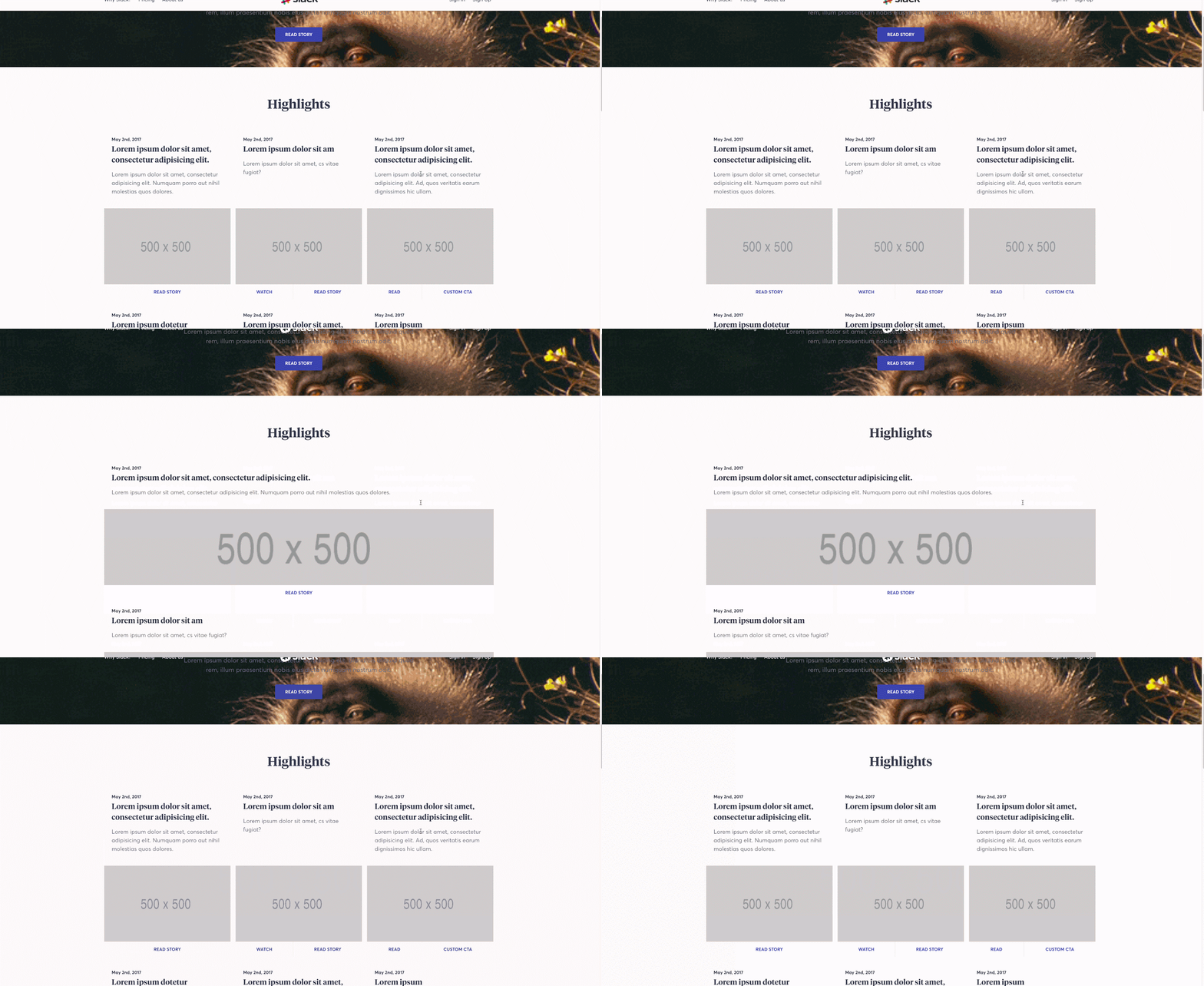
We decided that addressing the jarring experience of the layout shift was a higher priority than backwards compatibility. The compromise was to use CSS Grid as an enhancement and fallback to Flexbox and other techniques when needed.
Instead of using a library to detect Grid support, we went with CSS feature queries. Unfortunately, feature queries aren’t supported in every browser. This means that any browser that can’t handle the @supports rule will not get the CSS Grid layout, even if that browser supports Grid. So IE11, for example, will always use our Flexbox-based layout even though it supports some Grid features.
We use some features of Grid that aren’t currently fully supported in all browsers, the most notable being percentage-based grid-gap. Although support for this has been implemented in some versions of Safari, we still needed to anticipate its absence. In practice, a Grid object is styled as follows:
@supports (display: grid) and (grid-template-columns: repeat(3, 1fr)) and (grid-row-gap: 1%) and (grid-gap: 1%) and (grid-column-gap: 1%) {
    .c-photo-collage {
        display: grid;
        grid-gap: 1.5rem 2.4390244%;
    }
    .c-photo-collage > :nth-child(1) {
        grid-column: 1 / span 3;
        grid-row: 1;
    }
    .c-photo-collage > :nth-child(2) {
        grid-column: 2;
        grid-row: 2;
    }
    .c-photo-collage > :nth-child(3) {
        grid-column: 4;
        grid-row: 1;
        align-self: flex-end;
    }
    .c-photo-collage > :nth-child(4) {
        grid-column: 3 / span 2;
        grid-row: 2 / span 2;
    }
};
Any browser that doesn’t meet the query requirements will use our flexbox fallbacks instead.
@supports not ((display: grid) and (grid-column-gap: 1%)) {
    /* fabulously written CSS goes here */
}
Fluid typesetting
Once we had responsive layouts, we needed equally adaptable typography. We created Less mixins to help us fine-tune our typesetting. Typeset is a mixin that acts as single source of truth for all typography settings. For each type style, a new line is created inside the mixin that contains the name or purpose of the style, followed by a list of settings for each style. They are, in order: font-family, min and max font-size (in rems by default), line-height, font-weight, and any text-transforms, such as uppercase. For clarity, each type name is prefixed with display-as- to make its purpose plain.
Here’s a simplified version of the mixin:
.m-typeset(@setting) {
    @display-as-h1: @font-family-serif, 2, 2.75, 1.1, @font-semibold;
    @display-as-btn-text: @font-family-sans, .9, .875, 1.3, @font-bold, ~”uppercase”;
    font-family: extract(@@setting, 1);
    font-weight: extract(@@setting, 5);
    line-height: extract(@@setting, 4);
}
See it in action:
.c-button { .m-typeset(“display-as-btn-text”); }The logic for this mixin takes a parameter, such as display-as-btn-text, and extracts the settings from the list at the index indicated for each property. In this example, the line-height property would be set to 1.3 because it is the 4th indexed value. The resulting CSS would be
.c-button {
    font-family: ‘Slack-Averta’, sans-serif;
    font-weight: 700;
    line-height: 1.3;
    text-transform: uppercase;
}
Art direction & imagery
Alice Lee provided us with some beautiful illustrations, and we wanted to make sure we showcased them in the best possible light. Sometimes it was necessary to display a different version of an image depending upon the viewport width. We toggled between retina vs. non-retina assets, and made image adjustments for specific screen widths.
This process, also known as art direction, is accomplished by using the picture and source elements with Picturefill as a polyfill for older browsers. Defining characteristics, like device size, device resolution, orientation allows us to display different image assets when the design dictates it.
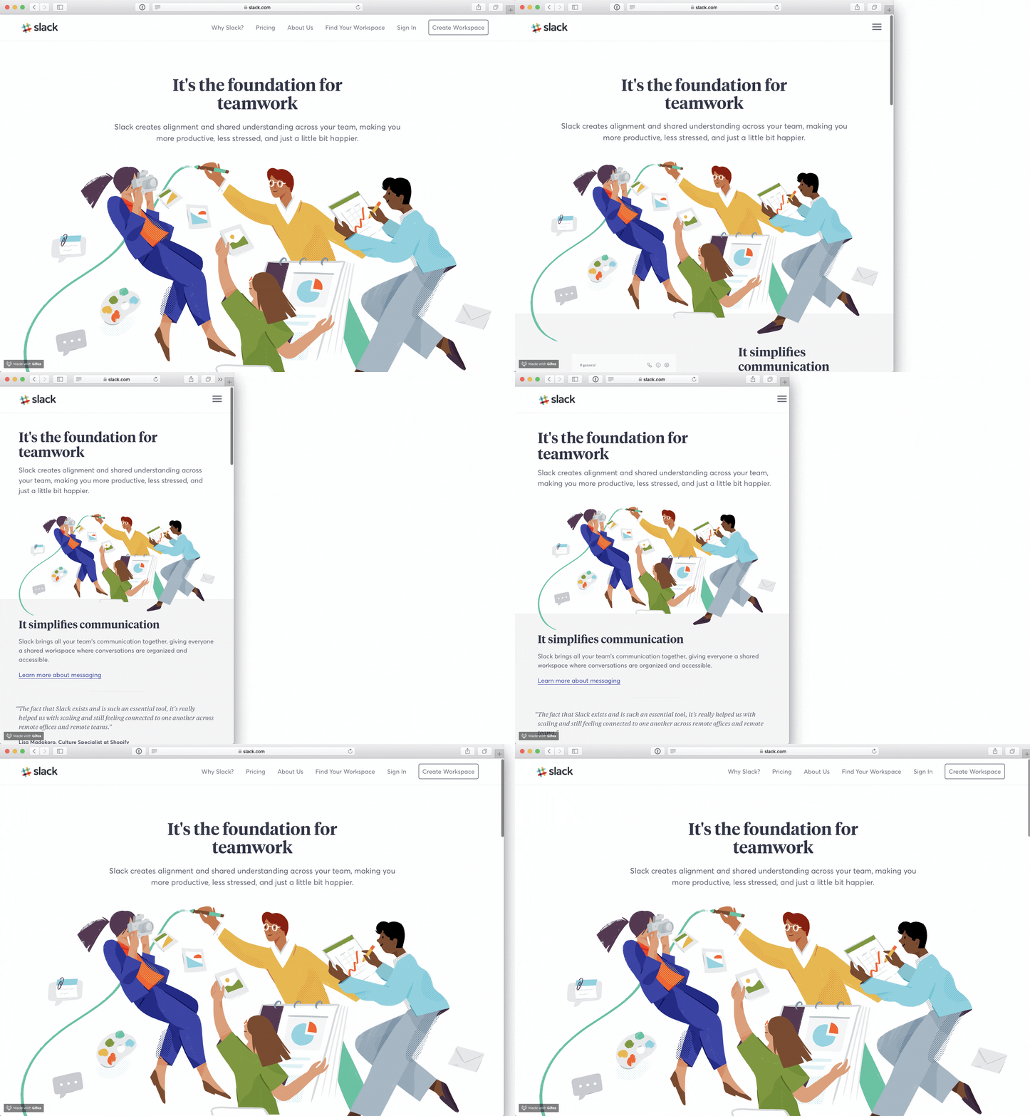
With these tools, we were able to display the best possible version of an asset based upon query parameters we set. In the above example, the main hero image needed a simpler version for a smaller viewport.
<picture class=”o-section__illustration for-desktop-only”>
    <source srcset=”/img/features/information/desktop/hero.png” sizes=”1x, 2x” media=”(min-width: 1024px)” alt=””>
    <img srcset=”/img/features/information/mobile/hero.png” sizes=”1x, 2x” alt=””>
</picture>
This technique allows us to specify which image asset is shown for a particular media query, plus if retina and non-retina assets are needed and available. The end result is greater art direction throughout the site.
Inclusive, from the start
Another major goal was to ensure that low-vision, screenreader and keyboard-only users could navigate the site with ease. While starting from a clean codebase, we were able to make many impactful improvements to color contrast, semantic HTML and keyboard accessibility with little additional effort. Additionally, we were able to work in some new features for a more accessible experience. We added a skip link before the navigation so that users could bypass the menu if desired. For a better screenreader experience, we added an aria-live region and helper functions to announce form errors and route changes. In addition, interactions are keyboard accessible with noticeable focus states. We also strived to use clear, descriptive alt text.
Looking Forward
There are always more wins to be had for better performance, maintainability and accessibility. We are refining our site telemetry to better understand where the bottlenecks lie and where we can make the most impact. We’re proud of the progress we have made; progress that will surely serve us well as we look to create a more pleasant experience for our customers around the world.
Can you help Slack solve tough problems and join our team? Check out all our engineering jobs and apply today!
Apply now


